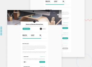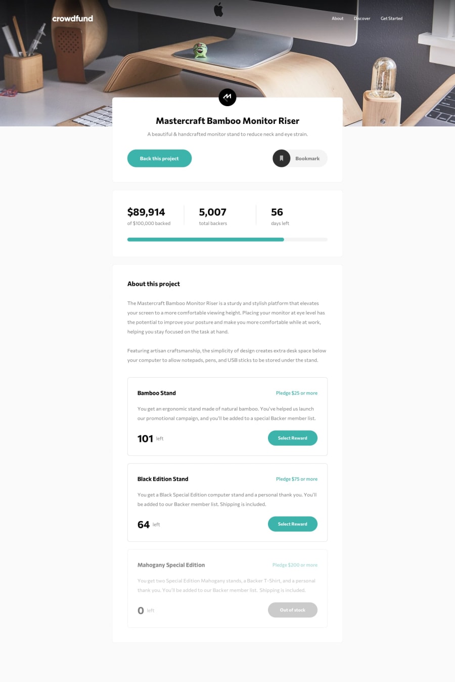
Design comparison
Solution retrospective
Any feedback is great appreciated! :wave:
Community feedback
- @RayaneBengaouiPosted over 3 years ago
Hello Vinci Taylaran,
First of all, congrats for the challenge !
I'd like to add a suggestion for the scroll bars. When you click on the "back project button" to open the pop-up, it adds a scroll bar which is quite heavy looking on the right in my opinion. So by toggling
overflow: hiddenon the body it should remove the unnecessary one.Overall, well done for the challenge and happy coding ! 😃
1@vincitaylaranPosted over 3 years ago@RayaneBengaoui Good catch! I didn't notice that until you pointed it out. Thanks!!
0 - @pikapikamartPosted over 3 years ago
Hey great work you got there. But there are littles issues?
- At point
480px, you could white spaces on the screen, that is cause by something that is overlapping its container and you could see that the elements at the point is not visible and unscrollable. - To fix this, you could just remove the
widthproperty in your.card-module--card--3Pd5mclass .3 Remove the outline of the buttons so that when it is clicked, there will be no box that appears
^^
1@vincitaylaranPosted over 3 years ago@pikamart Thanks! I think I fixed the problem you mentioned by updating the media query to hide and show certain components at 480px. You just saved me from being embarassed by potential employers haha!
0@pikapikamartPosted over 3 years ago@vincitaylaran hahaha I think even with that issues, they will still see you as potential fellow, you are good and I visit your portfolio, dang ^^
0 - At point
Please log in to post a comment
Log in with GitHubJoin our Discord community
Join thousands of Frontend Mentor community members taking the challenges, sharing resources, helping each other, and chatting about all things front-end!
Join our Discord
