

Design comparison

Solution retrospective
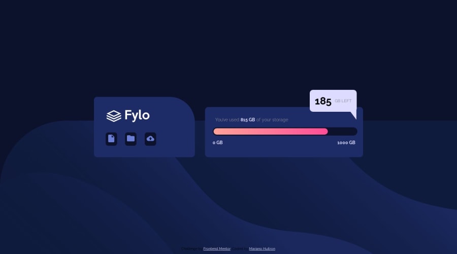
I don't know if my background image is positioned correctly but I like it!
Community feedback
- @emestabilloPosted over 4 years ago
Hi @MarianoHuitron, congrats on completing this challenge! It's responsive and looks just like the design. For your background, try this when it hits the
768pxbreakpoint:background-size: 100% 50%;. It will keep the background consistently at the bottom half of the screen as the widths go up. Another nitpicky detail, if you will, is that the chat bubble is not flush with the.alertbox. Adding half a percentageleft: 79.5%;makes it much better. Hope this helps :-)2@MarianoHuitronPosted over 4 years ago@emestabillo thanks for the feedback! I made the changes suggested.
1


Please log in to post a comment
Log in with GitHubJoin our Discord community
Join thousands of Frontend Mentor community members taking the challenges, sharing resources, helping each other, and chatting about all things front-end!
Join our Discord