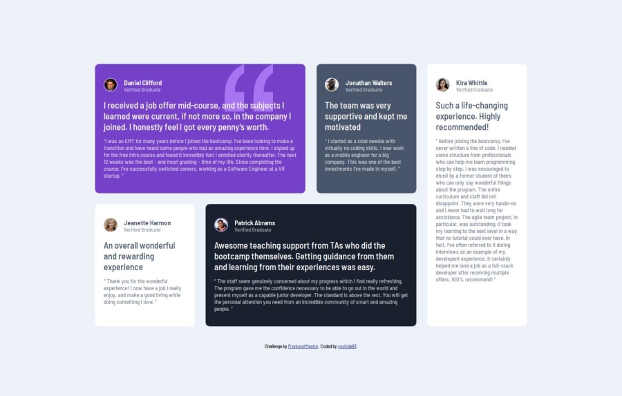


Design comparison

Solution retrospective
I'm proud that I'm starting to get the hang of using grid. Previously my default was to use flexbox which I'm more comfortable with. Next time I might try to add an additional media query to between the full desktop and mobile designs.
What challenges did you encounter, and how did you overcome them?Initially working with grid was difficult due to inexperience. Watching tutorials and playing around with simple examples was helpful getting a feel for grid. After working with simpler examples I was ready to apply them to this design. Also this was the first time I've added an svg background.
What specific areas of your project would you like help with?Like the last few challenges I've done I feel like my design looks fine at larger screens and mobile but it looks a bit awkward for some in between values. Any advice on this would be much appreciated.
Please log in to post a comment
Log in with GitHubCommunity feedback
- @Symplyteeziy
Good design, keep it up.

Join our Discord community
Join thousands of Frontend Mentor community members taking the challenges, sharing resources, helping each other, and chatting about all things front-end!
Join our Discord