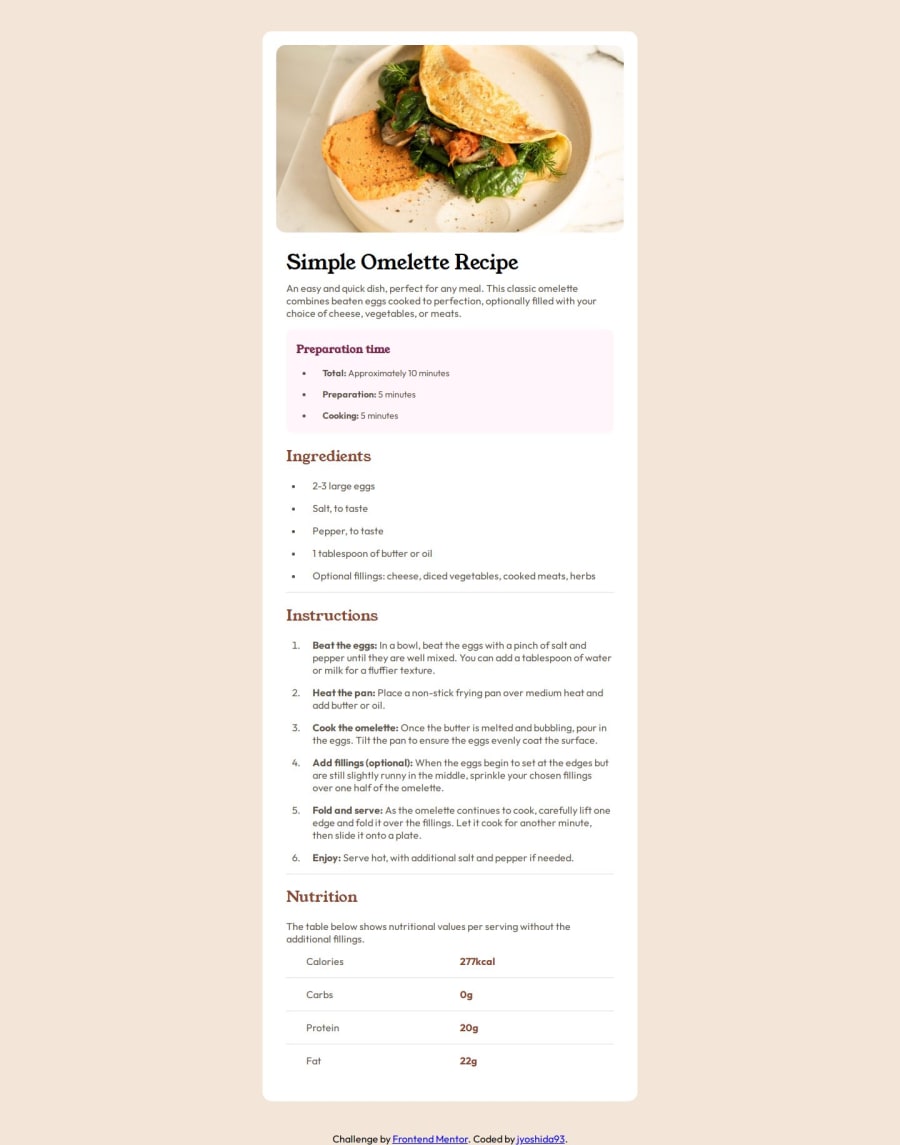
Design comparison
Solution retrospective
I'm proud I stuck with this challenge and actually submitted it for review. I started off with desktop in mind before considering the mobile design. I got my code specifically my layout into a bad state and decided to start over with a mobile first approach. This worked better so I'll probably approach future problems mobile first.
What challenges did you encounter, and how did you overcome them?My biggest challenge was getting the general layout to work for desktop and mobile. As I mentioned in the previous question restarting with a mobile first design approach helped. Another challenge was getting the nutrition table to work. I initially tried getting it to work with grid but found it hard to get the bottom border to work. I got stuck so I tried using a flexbox instead and that approach worked better for me.
What specific areas of your project would you like help with?I really struggled with getting the layout to work for different screen sizes so any advice on that would be great. Also my CSS file is mess and I'm not sure how to structure the general layout of the file ie do I put element selectors above class selectors file etc.
Please log in to post a comment
Log in with GitHubCommunity feedback
- @Dpal88
Hi @jyoshida93,
Great job on completing this challenge!
And your solution does a great job of matching the design, but I have few tips that could make it even better!
1. Right now I think your design looks great on larger screens, however there is one small issue on mobile screens where the image is not scaling properly. This can be easily fixed though by simply removing the height property from the image.
2. As far as organizing your CSS file goes, there's not a right or wrong way of doing things. But I would suggest looking into some different CSS methodologies, which are essentially CSS coding guides that take a very structured approach to writing and organizing CSS. One of the most popular methodologies that I see people using is BEM (Block, Element, Modifier), I'll leave a link below if you are interested in reading more about this.
https://getbem.com/introduction/
However, for smaller projects I would say it doesn't matter to much how you go about organizing you CSS file as long as you are keeping things consistent. I would also recommend adding comments to your code. These can be used to divide your stylesheet into sections, explain complex styles, etc.
3. Also I noticed that your bulleted lists & numbered lists do not have the correct colors set. To target the actual bullets and numbers you can use the CSS ::marker pseudo-element.
I hope this helps, and if you have any questions feel free to message me!
Marked as helpful
Join our Discord community
Join thousands of Frontend Mentor community members taking the challenges, sharing resources, helping each other, and chatting about all things front-end!
Join our Discord
