Submitted over 3 years ago
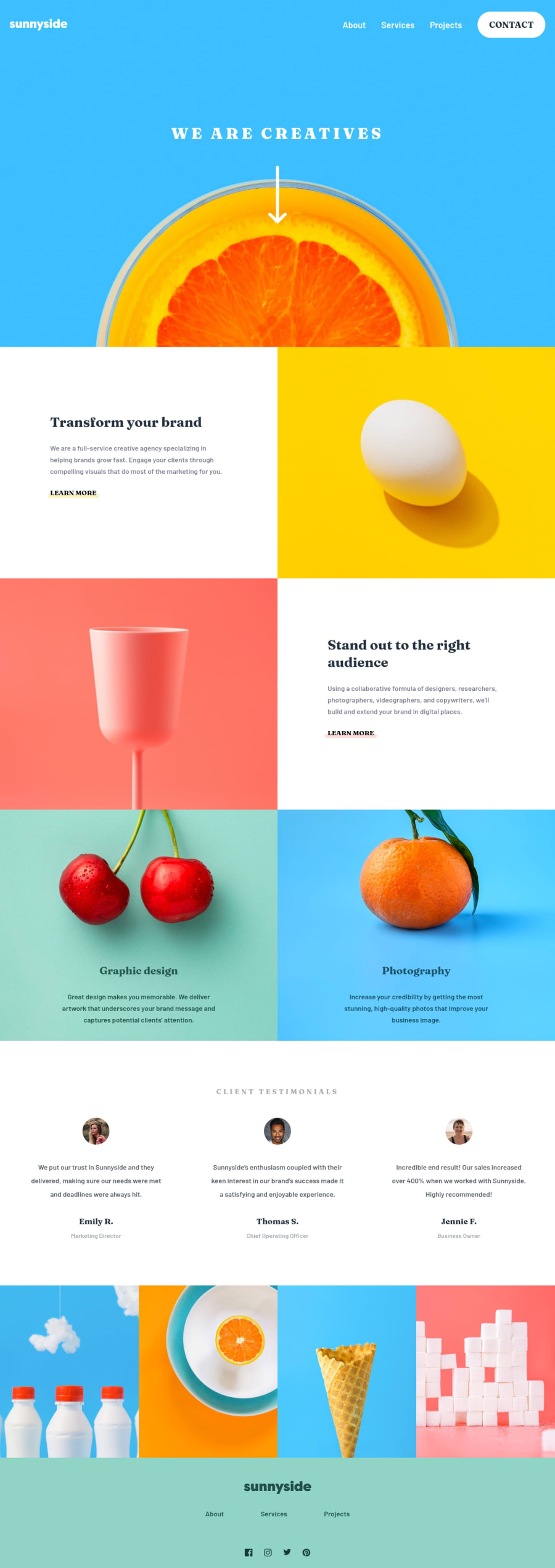
Mobile First Responsive Landing Page using HTML, SASS, JS, and Gulp
@fidellim
Design comparison
SolutionDesign
Solution retrospective
Any suggestions or feedback will be appreciated!
Community feedback
- @pikapikamartPosted over 3 years ago
Hey, really nice work on this one. Layout in desktop looks really great, it is responsive and the mobile state looks really great as well.
Some suggestions would be:
- Website-logo
imgshould be using the website's name as thealtlikealt="sunnyside". Remember that a website's logo is meaningful so always make sure it uses the properaltvalue. - Also when using
altattribute, avoid using words that relates to "graphic" such as "logo" and others. Animgis already an image/graphic so no need to describe it as one. - Since you are making the website-log interactive by putting
cursor: pointerto it on desktop, why not just make it anatag so that it will be lot clearer what it does. - Those
sectiontags should be inside themainand not sitting on their own row. - Using
atag rather than button on thelearn morewill suit more since on a real site, that would be another page for the user to "learn more" about a section. - Use only the person's name for the person's image as the
alt, you can lose theprofile. - Text after the person's name should not be a heading tag since it doesn't really add any information on what the section is all about. The person's name is the suited heading on this one. Though personally, if I were to do this, on my markup, it will be reverse, the heading is first and last is the testimonial text because if I focus on the heading right now via screen-reader, when I go to the next text I will assume that it is the testimonial but since the heading is last on the markup, I would traverse to the next testimonial card.
image
text
heading # in here, after this, the next testimonial
On my approach:
image
heading # after going to next line, I will know the testimonial content right away
text
FOOTER
- Same goes for the website-logo, use proper
altand make it useatag. - Social media links could be inside
ulsince those are "list" of links. - Each
atag that wraps social media, it should have eitheraria-labelattribute or screen-reader element inside it. The value for whatever method you will use should be the name of the social media likearia-label="facebook"on the facebook linkatag. This way, users will know where this link would take them. - The social-media-image is just a decorative image so better hiding it, the
atag's label is enough to describe it.
MOBILE
- Hamburger menu should be using a
buttonelement since it is a control. Again, interactive components uses interactive elements. By usingdivyou are making it not-accessible.
SUPPOSING BUTTON IS USED
- The
buttonwill be using the method I mentioned usingaria-labelattribute or screen-reader element inside. The value will describe what does thebuttondo. The value could bearia-label="navigational dropdown menu". - The
buttonshould have a defaultaria-expanded="false"attribute on it. It will be set totrueif the user toggles thebutton. - The placement of the toggle and the dropdown is incorrect. The toggle should be placed "before" the dropdown in the markup, so that the focus will be next to the dropdown if the
buttonhas been toggled. Swap them up.
Aside from those, great job again on this one.
Marked as helpful2@fidellimPosted over 3 years ago@pikamart Thank you Raymart for always giving detailed feedback!
1 - Website-logo
Please log in to post a comment
Log in with GitHubJoin our Discord community
Join thousands of Frontend Mentor community members taking the challenges, sharing resources, helping each other, and chatting about all things front-end!
Join our Discord
