Submitted almost 4 years ago
Mobile First Project Tracking Intro Component using HTML, SCSS, and JS
@fidellim
Design comparison
SolutionDesign
Solution retrospective
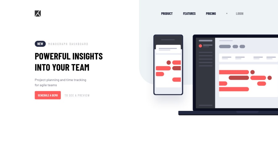
Would love to ask for your feedback! Also, I would like to ask is there a better way for me to position the illustration?
Community feedback
- @MasterDev333Posted almost 4 years ago
Great work! fully responsive and close to design. Here're some suggestions.
- It would be great if you add transitions to buttons.
please add
transition: all .3s ease-in-outfor example. - on mobile view, please remove min-width for hero image
- and personally, I think it would be great if you put landing-page-container outside of header tag. Hope this helps. Happy coding ~ :)
1 - It would be great if you add transitions to buttons.
please add
Please log in to post a comment
Log in with GitHubJoin our Discord community
Join thousands of Frontend Mentor community members taking the challenges, sharing resources, helping each other, and chatting about all things front-end!
Join our Discord
