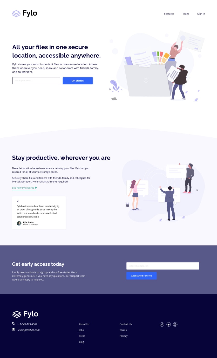
Mobile first Fylo landing page using Sass, JavaScript
Design comparison
Solution retrospective
Hello👋!
No specific questions but any additional feedback will be appreciated!
Thanks! 😁
Community feedback
- @MasterDev333Posted about 4 years ago
Great work @tediko. I love your animations, especially header link hover animation. It would be better if you use anchor tags for footer phonenumber and mail. You may use tel and mailto attributes for direct call and message. Hope it helps. Happy coding~ :)
1P@tedikoPosted about 4 years ago@MasterDev333 Thanks for feedback! It helps! Happy coding too!
0 - @ApplePieGiraffePosted about 4 years ago
Hey, tediko! 👋
Nice to see you complete another challenge! Great job on this one, as usual! 👏
Everything looks great and the page responds very nicely! 👍
I like the creative hover and active states you add to the elements like the links and buttons in your solutions. 🤩
Keep coding (and happy coding, too)! 😁
1 - @grace-snowPosted about 4 years ago
Looks nice, well done!
I'd probably make the focus state a bit more obvious, use more consistent animations, lighten the input border so it matches the design and adjust the button shadow (makes it look a bit blurry atm)
But those are all dead small things really. Good job
1
Please log in to post a comment
Log in with GitHubJoin our Discord community
Join thousands of Frontend Mentor community members taking the challenges, sharing resources, helping each other, and chatting about all things front-end!
Join our Discord
