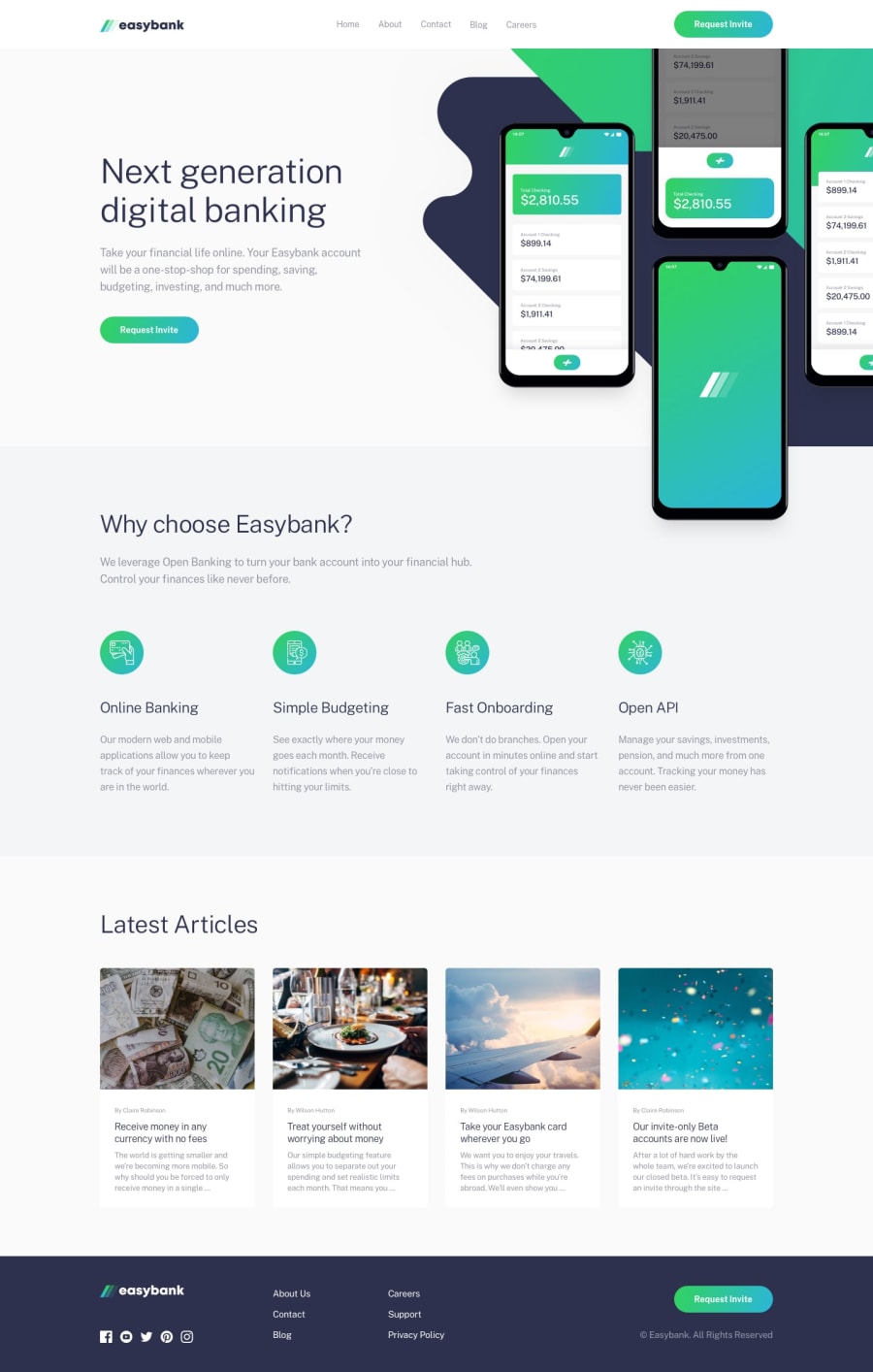
Design comparison
Solution retrospective
Had a fun time coding this challenge, was a little tough adjusting the svg's but everything turned out right.
Would Love to hear your thoughts about It
Community feedback
- @tedikoPosted over 3 years ago
Hello, Aman Patil! 👋
Good effort on this challenge! 🎉 Everything works good and responds well. Take a look at:
- Add
:focuspseudo class to interactive elements like anchors, buttons etc. Useoutlineproperty to make your website more accessible to keyboard users. Focusable elements like anchor, buttons or inputs they have applied default:focuspseudo class withoutlineproperty. These default styles are subtle and hardly visible tho. Furthermore every browser has a slightly different default style for the outline, so you probably want to change the default style. Read more about why we should change focus styles. - You can add
classto your html elements likesection footeretc instead of creating another unnecessary div within that element to style it.
Good luck with that, have fun coding! 💪
1@Amanpatil-DevPosted over 3 years ago@tediko thank you so much for your kind feedback, I will refactor as soon as I can and I will keep it in mind
0 - Add
- Account deleted
Nice one on completing the challenge.
The 'request invite' button on the navigation bar looks like it needs a little fix, the other one looks fine, how about getting it to be like the other one. I like the border when you click on them.
1@Amanpatil-DevPosted over 3 years ago@thulanigamtee thank you so much for your feedback I will refactor it as u said
0
Please log in to post a comment
Log in with GitHubJoin our Discord community
Join thousands of Frontend Mentor community members taking the challenges, sharing resources, helping each other, and chatting about all things front-end!
Join our Discord
