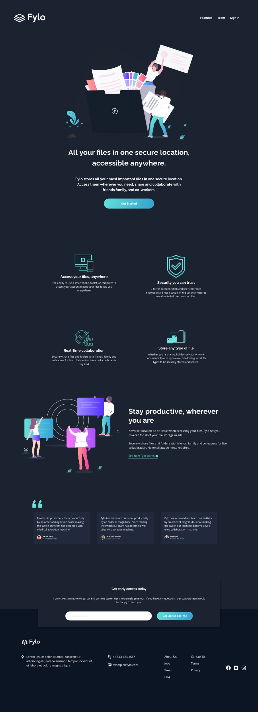
Design comparison
SolutionDesign
Solution retrospective
Feedback welcome!
I am still struggling to get these layouts pixel perfect.
Community feedback
- @tedikoPosted almost 4 years ago
Hello, John Norman! 👋
Congrats on finishing another challenge! Your solution responds well and looks good. You're very close to design, no need to be pixel perfect :) Here are few suggestions from me:
- Add
:focuspseudo class to interactive elements like anchors, buttons etc. Useoutlineproperty to make your website more accessible to keyboard users. Focusable elements like anchor, buttons or inputs they have applied default:focuspseudo class withoutlineproperty. These default styles are subtle and hardly visible tho. Furthermore every browser has a slightly different default style for the outline, so you probably want to change the default style. Read more about why we should change focus styles. - Since your logo/feature/avatar images are decorative your
alttext should be provided empty (alt="") so that they can be ignored by assistive technologies, such as screen readers. - Change
z-indexfor footer because now it isn't clickable since you set negative z-index on that container.
Good luck with that, have fun coding! 💪
1P@norman02Posted almost 4 years ago@tediko thanks for another piece of great advise!
0 - Add
Please log in to post a comment
Log in with GitHubJoin our Discord community
Join thousands of Frontend Mentor community members taking the challenges, sharing resources, helping each other, and chatting about all things front-end!
Join our Discord
