Submitted about 2 years ago
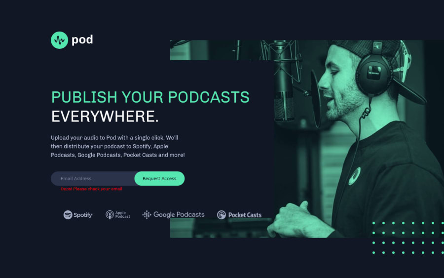
Mobile first attempt at Pod Access - HTML & CSS no JavaScript
@tarasis
Design comparison
SolutionDesign
Solution retrospective
First attempt at doing a "premium" newbie challenge. I found handling the positioning of elements between the 3 forms surprisingly difficult. I ended up using fairly fixed positioning for the pod logo, the dots used in tablet and desktop versions, and for the width of the "main content box".
Would love suggestions on improving it.
Many things are tweaked using properties when swapping into media queries, although not as many as I could. Impatience got the better of me in the end.
The email format checking was handled in HTML/CSS, with pseudo classes used to show / hide the error.
Community feedback
Please log in to post a comment
Log in with GitHubJoin our Discord community
Join thousands of Frontend Mentor community members taking the challenges, sharing resources, helping each other, and chatting about all things front-end!
Join our Discord
