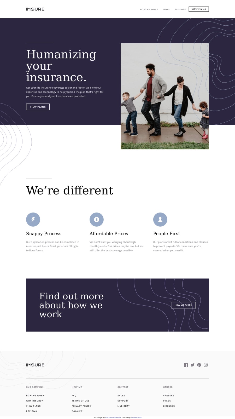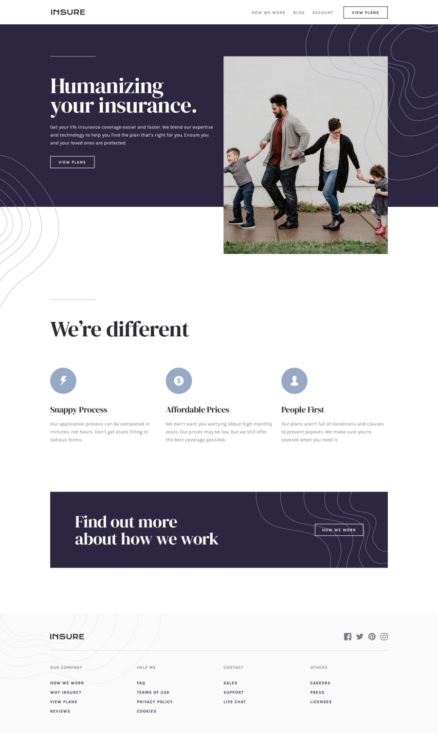
Design comparison
Solution retrospective
Any kind of feedback is welcome.
Community feedback
- @AgataLiberskaPosted over 3 years ago
Hi @avatarfreak! Really nice work here, everything looks responsive and I love the focus styles on links!
I noticed a small thing that could be corrected - you have this rule:
.menu-btn:hover .menu-btn__burger:after { /* transform: translate(3px,6px); */ }and similar for the before element. I really like the animation you've got on the mobile menu toggle, but I think this rule is making the top and bottom bars look wonky after you close the menu (when I then click next to it, they align themselves again). I tried unchecking them in the browser and everything is working fine, the animation still looks great :)I also think the social media links could use a similar focus style.
Again really nice work, I like it :)
2@avatarfreakPosted over 3 years ago@AgataLiberska. Thanks for taking your time to review. I really appreciate it.
- Burger button. I did not notice, good catch. I totally forgot to remove the sticky hover on mobile devices. Done.
- focus visible on the social icon was not working for some strange reason, I got it fixed. Thanks for your detailed feedback. Happy coding.
0
Please log in to post a comment
Log in with GitHubJoin our Discord community
Join thousands of Frontend Mentor community members taking the challenges, sharing resources, helping each other, and chatting about all things front-end!
Join our Discord
