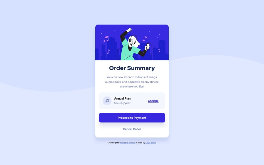
Design comparison
SolutionDesign
Solution retrospective
Aceitando feedbacks! 💪🏻
Community feedback
- @dusanlukic404Posted about 3 years ago
Hey Luiza, well done! You did it very nice. I have some suggestions for you:
- For better accessibility it's better to write more semantic HTML. In this case you should wrap your container and attribution inside a main element
- You don't need an empty div just to set background image. Use background image property on body element or main element
- Heading are there for writing also more semantic HTML so you should not use h1 and then h4. Increase them by one and style them how do you want in CSS
- On <img> element you should use alt attribute
- Check your accessibility and HTML issues and learn more about both of them. They are very important in Front-end Development
Marked as helpful0@luizzzabiassiPosted about 3 years ago@dusanlukic404 Hello, thank you very much for your comment, as soon as I can I will make these modifications, at the time I was doing it I just thought about trying to do it the easiest way for me, another more semantic HTML is really very important, thank you!
0
Please log in to post a comment
Log in with GitHubJoin our Discord community
Join thousands of Frontend Mentor community members taking the challenges, sharing resources, helping each other, and chatting about all things front-end!
Join our Discord
