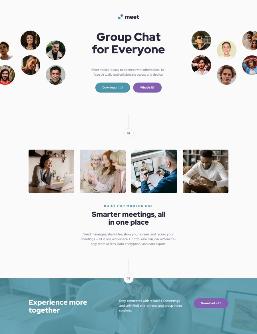
Design comparison
Solution retrospective
I am proud of creating tailored designs for desktop, tablet and mobile.
What challenges did you encounter, and how did you overcome them?Nothing that really stands out.
What specific areas of your project would you like help with?Open to any advice.
Community feedback
- P@clickgluePosted 6 months ago
Hi Daniel, I'm very impressed with how clean and precise your solution is. You even made an SVG for the logo! I'm very curious how you do that. Do you use special software or do you code this 'by hand'? I also see you make size specific sections in your HTML and that you use desktop as default: Is that a best practice? It looks clean! I'm also curious about your workflow: do you work from top to bottom? Do you start with CSS classes fro the design file (looks like it in teh VAR declarations). Thank you for the link tot the clamp value calculator. Maybe you are also interested in this site: https://utopia.fyi/, that also supports dynamic spacing etc. Learned a lot, thank you!!
0 - @VirshreePosted 6 months ago
hi @DAJ350, Your design looks accurate as per requirements ..Keep it up!!
0
Please log in to post a comment
Log in with GitHubJoin our Discord community
Join thousands of Frontend Mentor community members taking the challenges, sharing resources, helping each other, and chatting about all things front-end!
Join our Discord
