

Design comparison

Solution retrospective
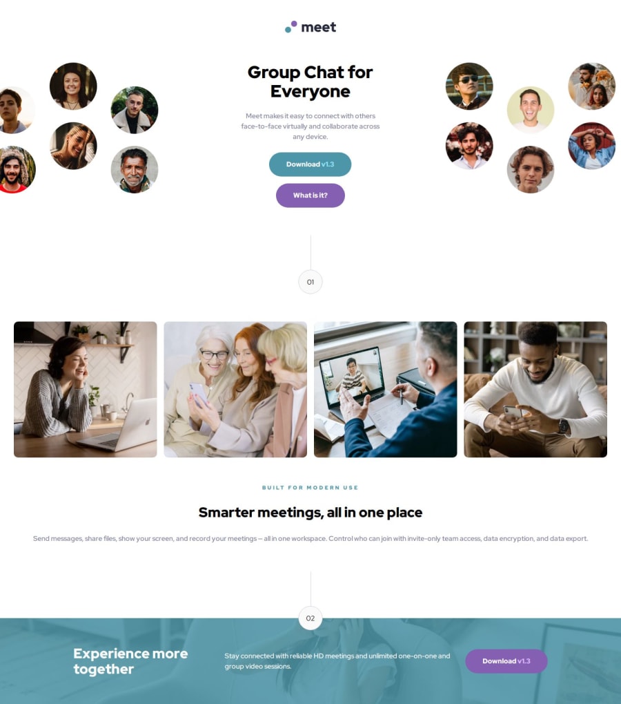
I spent a lot of time on the design part as many little details in this project need attention. Having access to Figma, I wanted to make it look as close to the design as possible. This is what I am satisfied with. Next time, I would spend some extra time planning my approach before heading to coding.
What challenges did you encounter, and how did you overcome them?I always have some challenges in making my webpage responsive while looking as close to the design as possible. I guess this will be true for my next challenge as well. You learn something new every time. This time I was hung for quite some time on the hero images. The solution was simple in the end. I just needed a little tweak with the width and was satisfied.
What specific areas of your project would you like help with?Maybe with the sass part. I think I included way too much code. Can I make it simple?
Community feedback
- P@mariosearchteamPosted 4 months ago
Hey Taresta,
great solution for this landing page. I don´t think there is too much code regarding the CSS.
I only found two small things you could improve a little bit:
- i found the "BEM" naming convention quite usefull for scss. You would use something like .hero and on the child .hero__title.
You then can select it like this:
.hero { color: #000; &__title { color: #fff; } } - you could wrap some elements on your page within containers to avoid grow unlimited. In this the gallery, some paragraphs and the footer. You can use something like a small utility class:
`.container { max-width: 70rem; margin-inline: auto; }
1 - i found the "BEM" naming convention quite usefull for scss. You would use something like .hero and on the child .hero__title.
You then can select it like this:

Please log in to post a comment
Log in with GitHubJoin our Discord community
Join thousands of Frontend Mentor community members taking the challenges, sharing resources, helping each other, and chatting about all things front-end!
Join our Discord