Submitted almost 3 years ago
meet landing page - Mobile First - HTML - CSS
@aldhairescobar
Design comparison
SolutionDesign
Solution retrospective
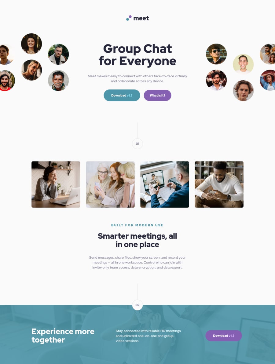
I'm trying to use a clean CSS, maybe I needed to use more classes here, the idea is to add some scroll animations on this project in the future, so any feedback on how I can improve it will be appreciated :)
Community feedback
- @UDsGitHubPosted almost 3 years ago
Hi Aldhair, I just saw your site and it looks great. My only comments are on your html report and stylistic stuff that i think would just make the site look a tad better in my opinion... just my opinion.
- You could use either swap the h2 and h3 between your "built for modern use" and your "Smarter meetings, all in one place" or use a span or a p element for your "built for modern use" and use css it scale it appropriately.
- You could also have both the section of images and the section after that in one section because it looks like it could or should be one. That would also help with the semantics of having a heading in each section.
- I feel as though this site is slick and cool enough to have a cooler scroll bar because my first impression on the site was that that scroll bar is blocking a bit of the images in the header section and if it were slimmer and slicker, it would look a lot better. Lastly, i just noticed by mistake, that you have some cool scaling happening on focus on your links/buttons. I think if you had that scaling on the buttons/links on hover, that would be cool to, but just a personal opinion. Great site and good luck 👍
Marked as helpful1@aldhairescobarPosted almost 3 years ago@UDsGitHub Thank you so much! I'm fixing those issues and your comments are helping me with the HTML structure (:
0
Please log in to post a comment
Log in with GitHubJoin our Discord community
Join thousands of Frontend Mentor community members taking the challenges, sharing resources, helping each other, and chatting about all things front-end!
Join our Discord
