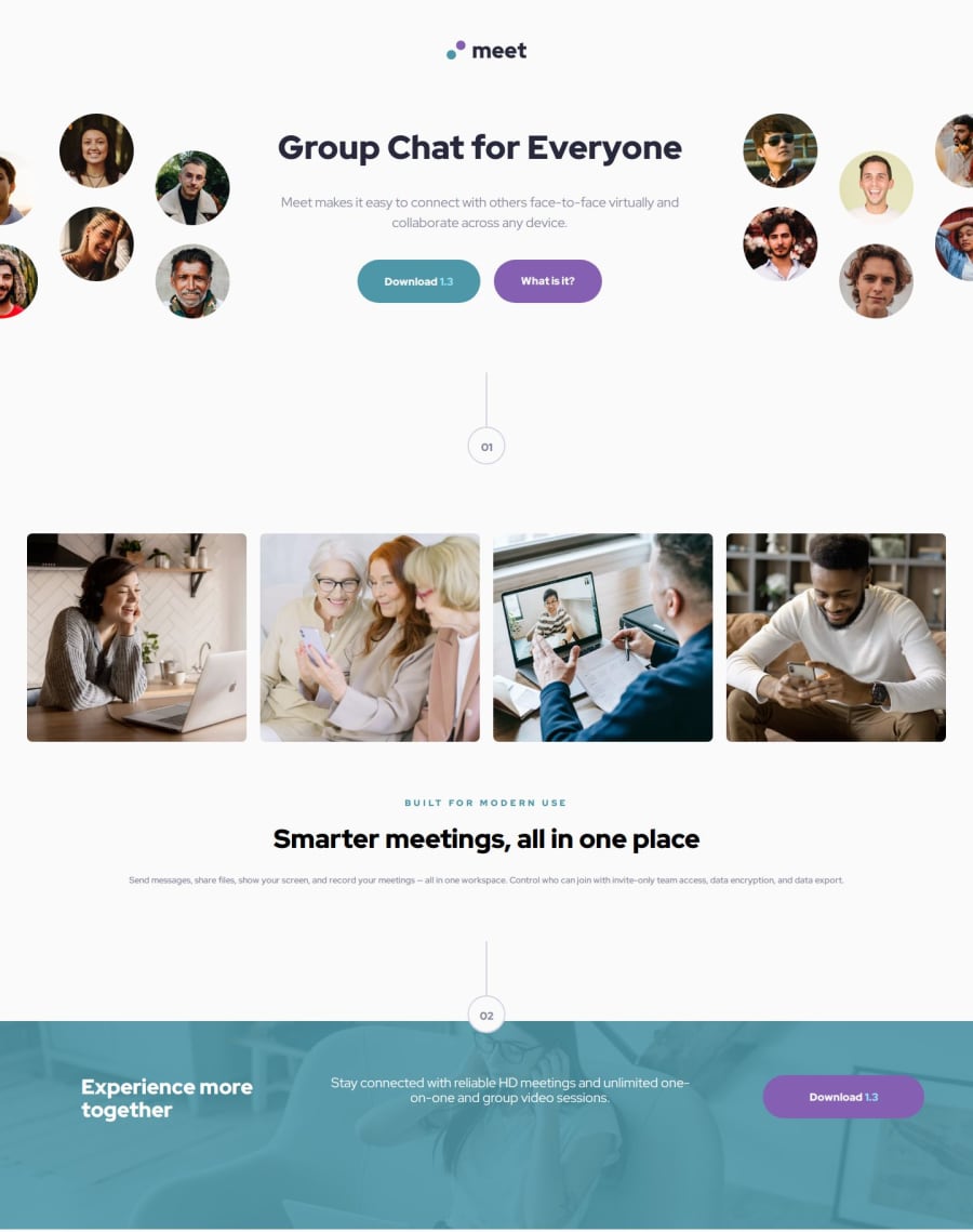
Design comparison
SolutionDesign
Solution retrospective
What are you most proud of, and what would you do differently next time?
I think I resolved most challenges in making the page responsive and in line with the design brief. I'm happy I finished it and didn't give up.
What challenges did you encounter, and how did you overcome them?Many challenges in applying grid (in combination with image overflow, SVG image, z-orders etc. I'm always in trouble with relative and absolute file references. This time I overstructured, by starting to create a million class descriptions and CSS variables. Structure is important, but don't overdo it, was my lesson.
What specific areas of your project would you like help with?I need to practice more with the 'cascade' in CSS, to make my code predictable.
Community feedback
Please log in to post a comment
Log in with GitHubJoin our Discord community
Join thousands of Frontend Mentor community members taking the challenges, sharing resources, helping each other, and chatting about all things front-end!
Join our Discord
