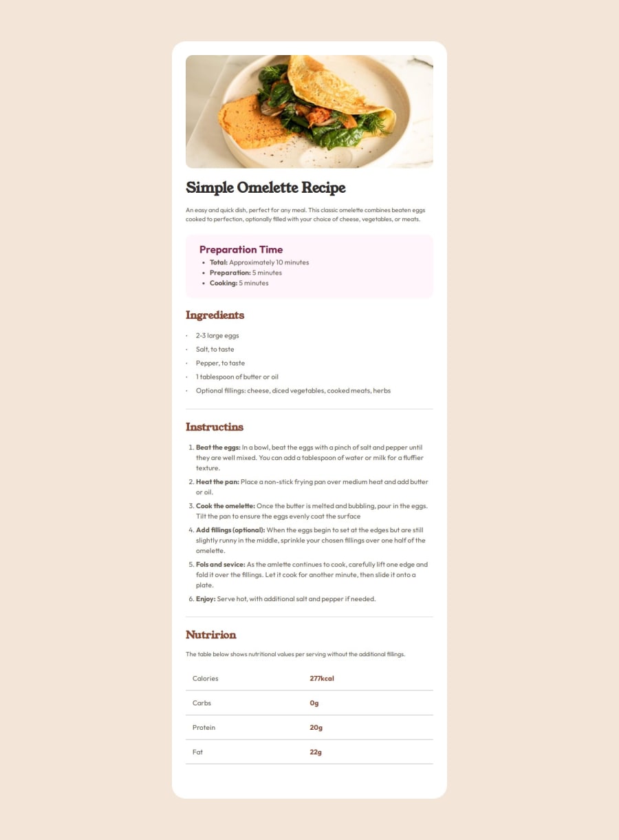
Design comparison
Solution retrospective
first time using root and table and successfully finishing my project with this solutions
What challenges did you encounter, and how did you overcome them?positioning and styling lists and tables
What specific areas of your project would you like help with?maybe there is best way to style those lists?
Community feedback
- P@StroudyPosted 7 months ago
Hello again! Incredible work on this! You’re making great strides, and I have a couple of suggestions that might push it even further…
-
This does not matter that much at this stage but something to be mindful of for SEO(Search Engine Optimisation),
<meta>description tag missing that helps search engine determine what the page is about, Something like this<meta name="description" content="description goes here" /> -
Here you should use
Max-width: 40rem;This allows the element to shrink but not grow bigger than40rem, Making it more responsive, -
You should also not set a height here and let the elements determine the height, If you needed more space at the bottom consider padding but for this challenge the elements will make up the height,
-
Using
remoremunits in@mediaqueries is better thanpxbecause they are relative units that adapt to user settings, like their preferred font size. This makes your design more responsive and accessible, ensuring it looks good on different devices and respects user preferences. -
I would like to see you start hosting your own fonts using
@font-faceimproves website performance by reducing external requests, provides more control over font usage, ensures consistency across browsers, enhances offline availability, and avoids potential issues if third-party font services become unavailable. Place to get .woff2 fonts -
I think you can benefit from using a naming convention like BEM (Block, Element, Modifier) is beneficial because it makes your CSS more organized, readable, and easier to maintain. BEM helps you clearly understand the purpose of each class, avoid naming conflicts, and create reusable components, leading to a more scalable codebase. For more details BEM,
You’re doing so well, and I hope this feedback is helpful! Keep honing your skills and remember to enjoy the process—you’re on a great path. Stay motivated, and happy coding! 🎯
Marked as helpful0P@miedzygalaktycznygitPosted 7 months ago@Stroudy I will use this advices in my next projects and Thank You for giving me opportunities to improve myself and my projects.
1P@StroudyPosted 7 months agoHey @miedzygalaktycznygit, Bro you got this! Lets go! 💪
0 -
- @paduiiiPosted 7 months ago
maybe there is best way to style those lists?
about this I have a answer for you after a long time I try searching the answers is you use
::marker { color: "any color you want to use"; }
this is what I use to change style of marker in list hope this can help you from a guy that struggling the same problem for so many hour hahahaha
Marked as helpful0
Please log in to post a comment
Log in with GitHubJoin our Discord community
Join thousands of Frontend Mentor community members taking the challenges, sharing resources, helping each other, and chatting about all things front-end!
Join our Discord
