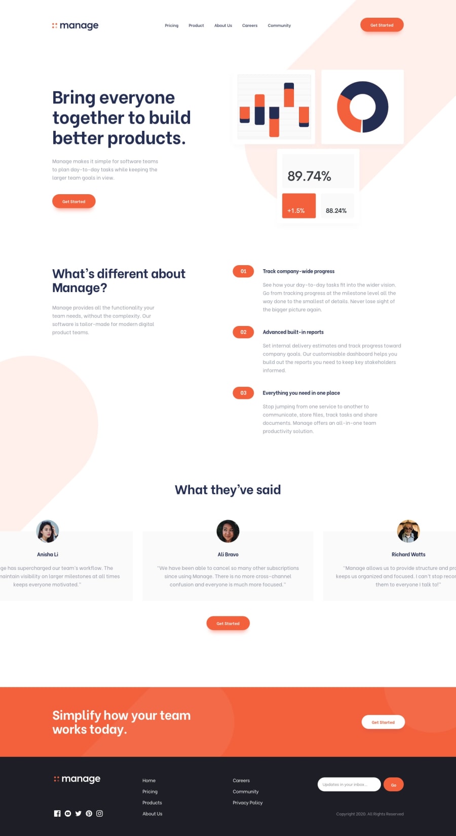
Manage Landing Page using HMTL, SCSS and JS
Design comparison
Solution retrospective
Hi everyone! I organized my stylesheets with scss partials to make is easier to read this time. I paid more attention to my html tags on this project, what do you guys think about the tags i used? Also I still have a hard time positioning background images and scaling them appropriately. Any suggestions? I have tried setting the width in percentage and the actual pixels in max-width, but the image never resized to follow the rules, so I ended up using width only (and height). I have looked at my project on Chrome, Firefox and Android, everything looks okay. When I open it on Safari it looks like I didn't make any layout (even worse on an iPhone). What did I miss? Any feedback on anything is very much appreciated, thank you!
Please log in to post a comment
Log in with GitHubCommunity feedback
No feedback yet. Be the first to give feedback on Cats-n-coffee's solution.
Join our Discord community
Join thousands of Frontend Mentor community members taking the challenges, sharing resources, helping each other, and chatting about all things front-end!
Join our Discord
