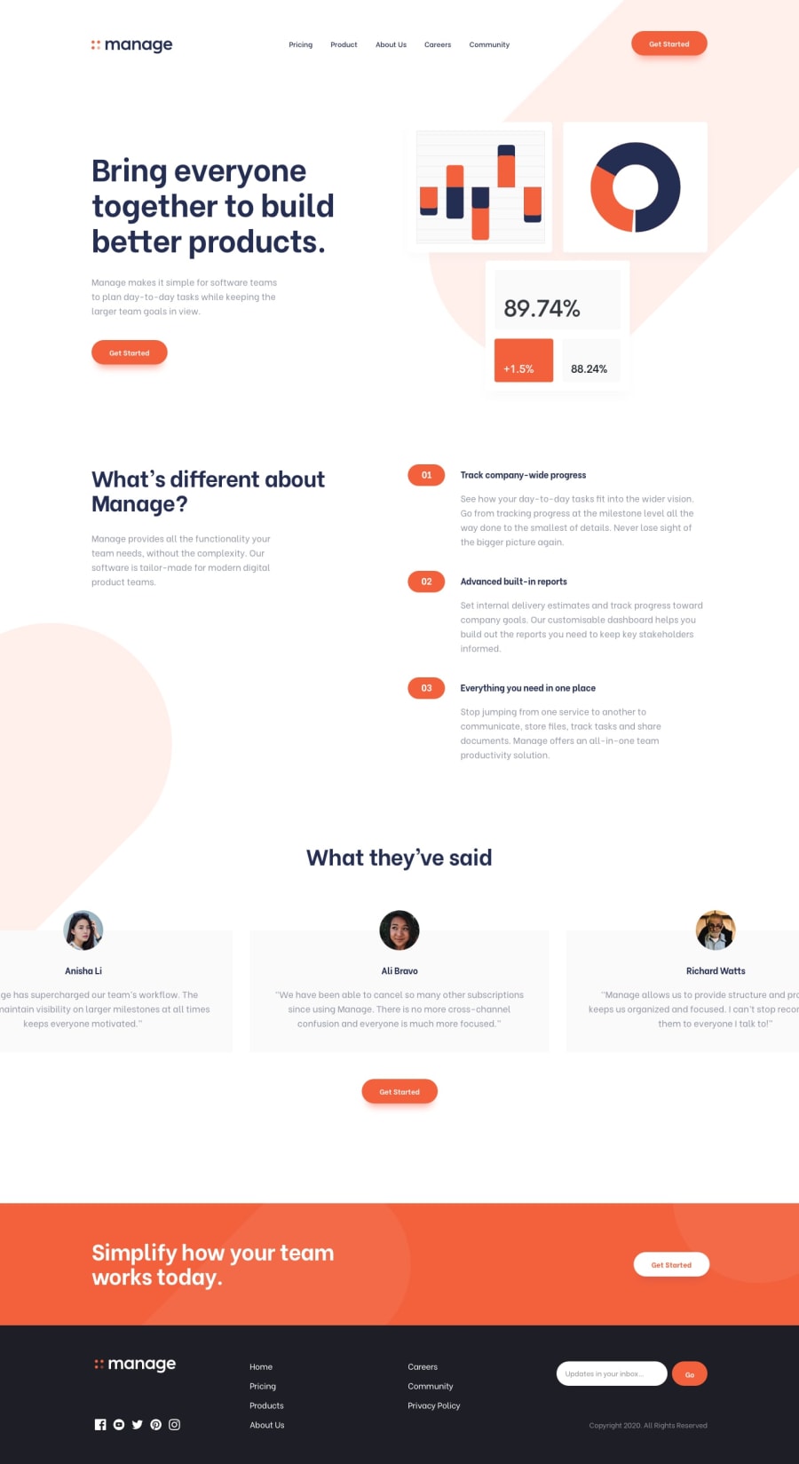
Manage landing page using flexbox, grid, sass, vanilla js
Design comparison
Solution retrospective
Tried to give it close look as the design. comment ♥ please!
Community feedback
- Account deleted
clicking the hamburger then going back to desktop does not dismiss the mobile menu, should be an easy fix. Otherwise everything looks great.
2@abhijitbcobPosted over 3 years ago@thulanigamtee thank you! now I have fixed that issue. Your feedback also helped me to find another issue that was unresponsive carousel and I fixed it too.
0 - @tedikoPosted over 3 years ago
Hello, Abhijit Barman! 👋
Congrats on finishing another challenge! 🎉 Your solution looks very good and also responds well. Here's my few tips:
- Add
:focuspseudo class to interactive elements like anchors, buttons etc. Useoutlineproperty to make your website more accessible to keyboard users. Focusable elements like anchor, buttons or inputs they have applied default:focuspseudo class withoutlineproperty. These default styles are subtle and hardly visible tho. Furthermore every browser has a slightly different default style for the outline, so you probably want to change the default style. Read more about why we should change focus styles. - Change the
altattributes for the.hero__imgand avatars images, as they don't add any extra context for screen reader users. Since your images are decorative youralttext should be provided empty (alt="") so that they can be ignored by assistive technologies.
Good luck with that, have fun coding! 💪
1@abhijitbcobPosted over 3 years ago@tediko thank you for your tips. Really
:focusis so important for accessibility. Now, I have updated my code as you said.0 - Add
- @shareef99Posted over 3 years ago
Great Work brother! I love it
1
Please log in to post a comment
Log in with GitHubJoin our Discord community
Join thousands of Frontend Mentor community members taking the challenges, sharing resources, helping each other, and chatting about all things front-end!
Join our Discord
