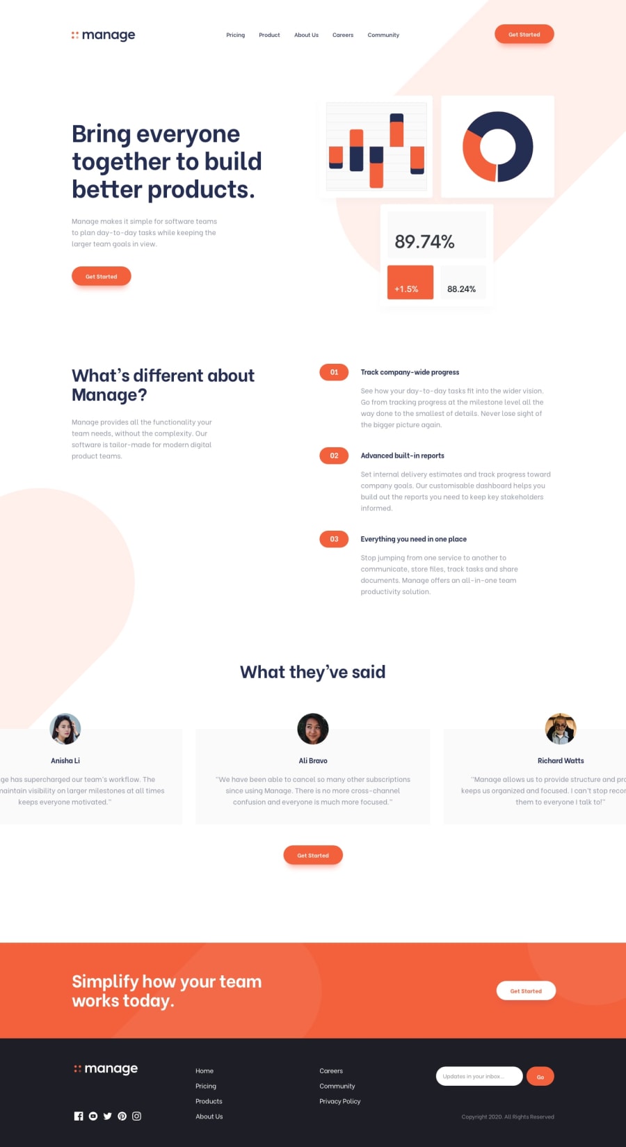
Design comparison
Solution retrospective
Not my best work, to be honest. I really wanted to make the navbar in mobile with just HTML and CSS. That was a really bad decition haha. I also really struggle with the background, didnt know how to position it like in the original desing. Any feedback about the background would be appreciated. I also didnt know how to make a carrousel for the quotes. Again, not my best work. But i learned a lot, thats for sure. For example: you cant make a hamburger menu with just CSS haha. Or at least is not easy.
Community feedback
- @emestabilloPosted about 4 years ago
Hey Felix, good job completing this challenge! I agree this is a really great exercise on responsive code. Aside from comments by APG, here are a few more things to consider:
-
You can certainly create the mobile menu through CSS only by using the checkbox hack. You'd need to use
inputandlabelfor your HTML. The hamburger menu can also be done in pure CSS. Coincidentally, I used both techniques for my own submission. -
The mobile menu is appearing on hover, instead of
onclick -
For the carousel, you can use vanilla JS or a library (I used Swiper for my project)
-
Look into addressing the issues in the html/accessibility report
Hope this helps!
1@PleopleqPosted about 4 years agoHello @emestabillo, thanks for your feedback!
I saw that input/label solution in some blog, but i didnt understand it. Now im more experienced with JavaScript, so i think i can fix this using a script.
I did the on hover mobile menu on purpose because i was really avoiding using Javascript at the time i made this challenge haha. Now i think is something really simple.
Again, thanks for spending your time giving me feedback. I'll check your submission.
Have a great day/evening/night!
1 -
- @ApplePieGiraffePosted about 4 years ago
Hey, Felix Anducho! 👋
You did a pretty good job! Glad you learned a lot, too (that's very important)! 😆
A few things you can start with to improve your solution would be,
- Turning the navigation links in both the header and footer of the page into actual links using anchor tags.
- Giving the buttons and the social media links in the footer of the page hover states.
- The close icon for the hamburger menu in the mobile layout of the site isn't showing up. You might want to look into that to see what's going on.
- I haven't actually completed this challenge yet, but the orange background shape in the hero section of the page might be a
::beforeor::afterpsuedo element that is absolutely positioned and rotated using thetransformproperty. That would be my best guess as to how to go about recreating it!
Keep coding (and happy coding, too)! 😁
1@PleopleqPosted about 4 years agoHi ApplePieGiraffe, thanks for the really well structured feedback!
Your solution about the background sounds makes more sense than mine (I didnt even know what i did, to be honest. I think i took it from another person from the solution tab)
Thanks a lot for the other points i will sure fix the problems that you point out.
Have a great day, evening or night!
1
Please log in to post a comment
Log in with GitHubJoin our Discord community
Join thousands of Frontend Mentor community members taking the challenges, sharing resources, helping each other, and chatting about all things front-end!
Join our Discord
