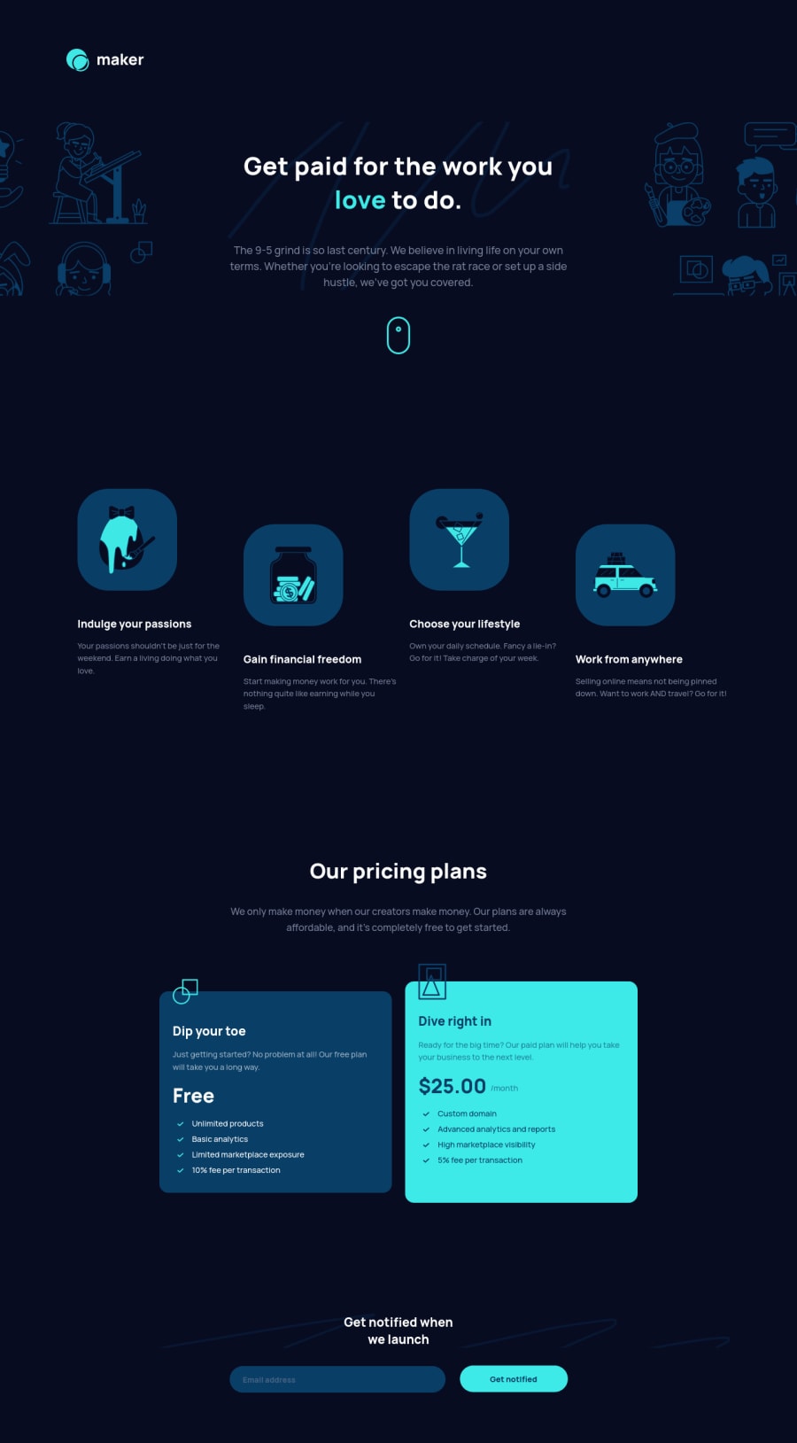
Design comparison
Solution retrospective
Any feedback is welcome This challenge was very funny :D
Community feedback
- @ApplePieGiraffePosted almost 4 years ago
Hey there, Aaron Gonzalez! 👋
Just wanted to drop in to say nice job on this challenge! 👏 Overall, I think your solution looks pretty good and it responds well! 🙌 Simply follow emestabillo's helpful suggestions, and I think you'll be good to go! 👍
Keep coding (and happy coding, too)! 😁
Marked as helpful1 - @emestabilloPosted almost 4 years ago
Hey Aaron, congrats on completing this challenge! Just a few things. I noticed there are two sets of the form on the footer. Same with the container for the hero background, there's one for mobile and another for larger screens. For these two cases, I think one should be able to do the job. For the form, it also means the JS is repeating the same block of code with different selectors.
Form validation could also use some editing. The error only shows when the value is empty. Otherwise it reloads and submits regardless of the input, which shouldn't be the case. I suggest looking into a regex for email validation to handle the submission.
Hope this helps :-)
Marked as helpful1
Please log in to post a comment
Log in with GitHubJoin our Discord community
Join thousands of Frontend Mentor community members taking the challenges, sharing resources, helping each other, and chatting about all things front-end!
Join our Discord
