
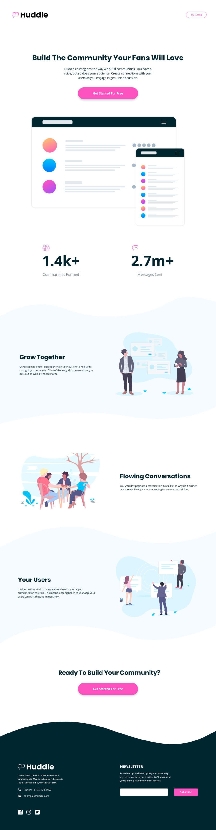
Made using HTML, CSS basics, Flexbox, Grid and mobile-first design


Design comparison
Solution retrospective
Hello!
Please Leave Some Feedback!
Any Feedback Is Very Much Welcome And Appreciated!
:)
Edit: seems that I really have a problem with the accessibility issues :))
Community feedback
- @dusanlukic404Posted about 3 years ago
Hi Robert, well done! I have a few suggestions for your solution:
- Make <h1> bigger on desktop version and also make sure to reduce margin-top on header on mobile version. It seems like 4.5rem would be perfect in my opinion
- On mobile you should have centered text and that's fine but on desktop your articles should have default text-align (left)
- Subscribe button on footer should be inline with input form
For accessibility issues I recommend you to take a look on this link: https://developer.mozilla.org/en-US/docs/Web/Accessibility
It helped me a lot so I hope that it would be helpful to you also 😄
Marked as helpful0@R0b3rtGPosted about 3 years ago@dusanlukic404 thank you for the feedback. I think I was in a hurry or something and I didn't notice the footer form not being as it should. The same with text size for desktop and alignment. I will try to fix some things. I really appreciate the feedback
0

Please log in to post a comment
Log in with GitHub
Join our Discord community
Join thousands of Frontend Mentor community members taking the challenges, sharing resources, helping each other, and chatting about all things front-end!
Join our Discord