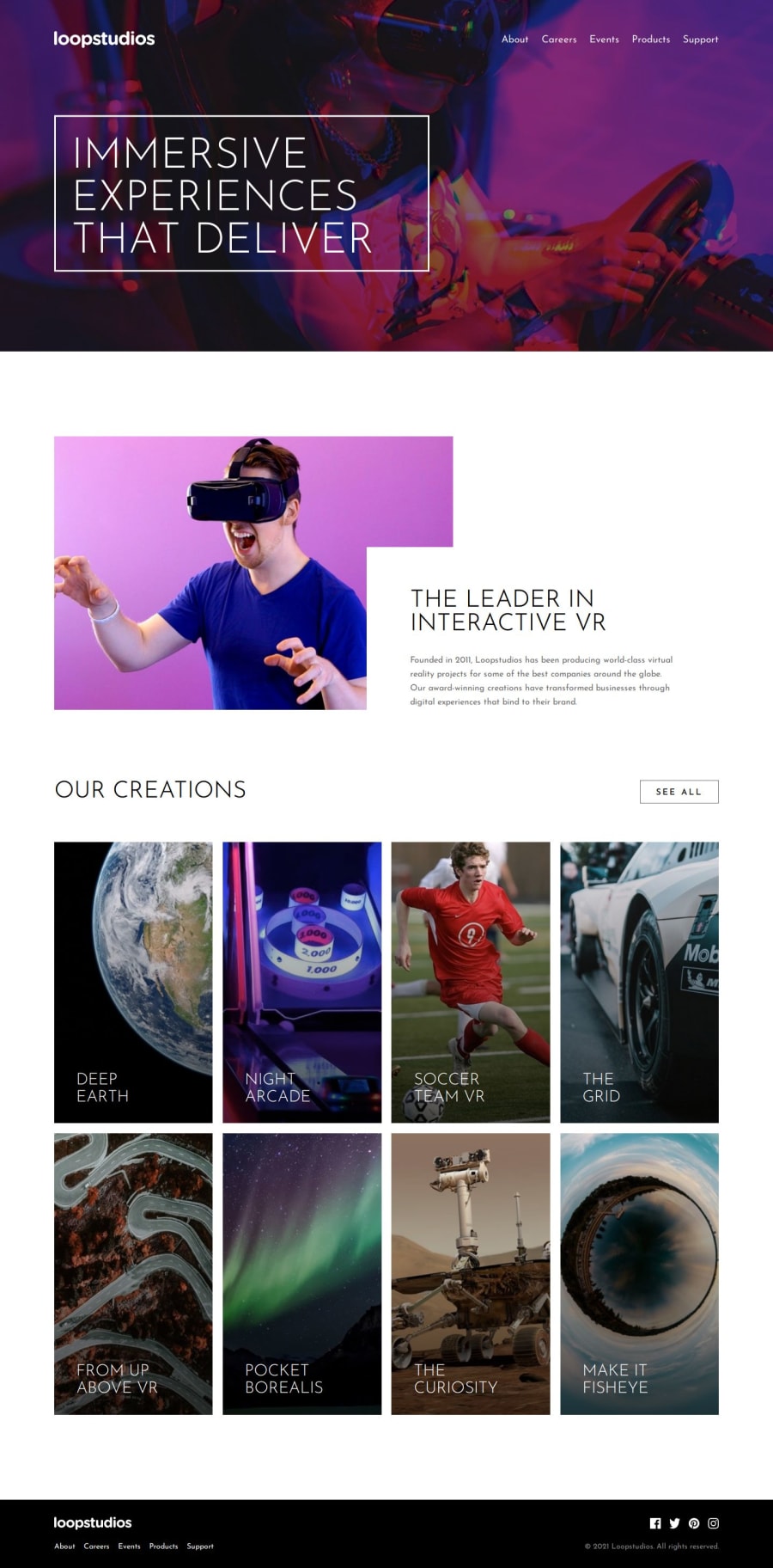


Design comparison

Community feedback
- P@toshirokubotaPosted 11 days ago
Congratulations on finishing the project. Your implementation responds well with various sizes (especially for table sizes). I just finished the same project, and I found mine did not cope well with the mid size width. I have a few comments that may help improving your coding/design. First, I would use <picture> element wrapping <img> element so that different display/device scenarios can be handled. This way, you can simplify your JavaScript code. Second, you have two identical menus, one for mobile and the other for desktop. You can change the case of text in css with text-transform. So you do not need to provide them. Third, it would be helpful to git-push your original SASS file so that we can follow your coding/design process better. When we only see a generated CSS, your process becomes less clear. Good luck and keep up the good work!
Marked as helpful0

Please log in to post a comment
Log in with GitHub
Join our Discord community
Join thousands of Frontend Mentor community members taking the challenges, sharing resources, helping each other, and chatting about all things front-end!
Join our Discord