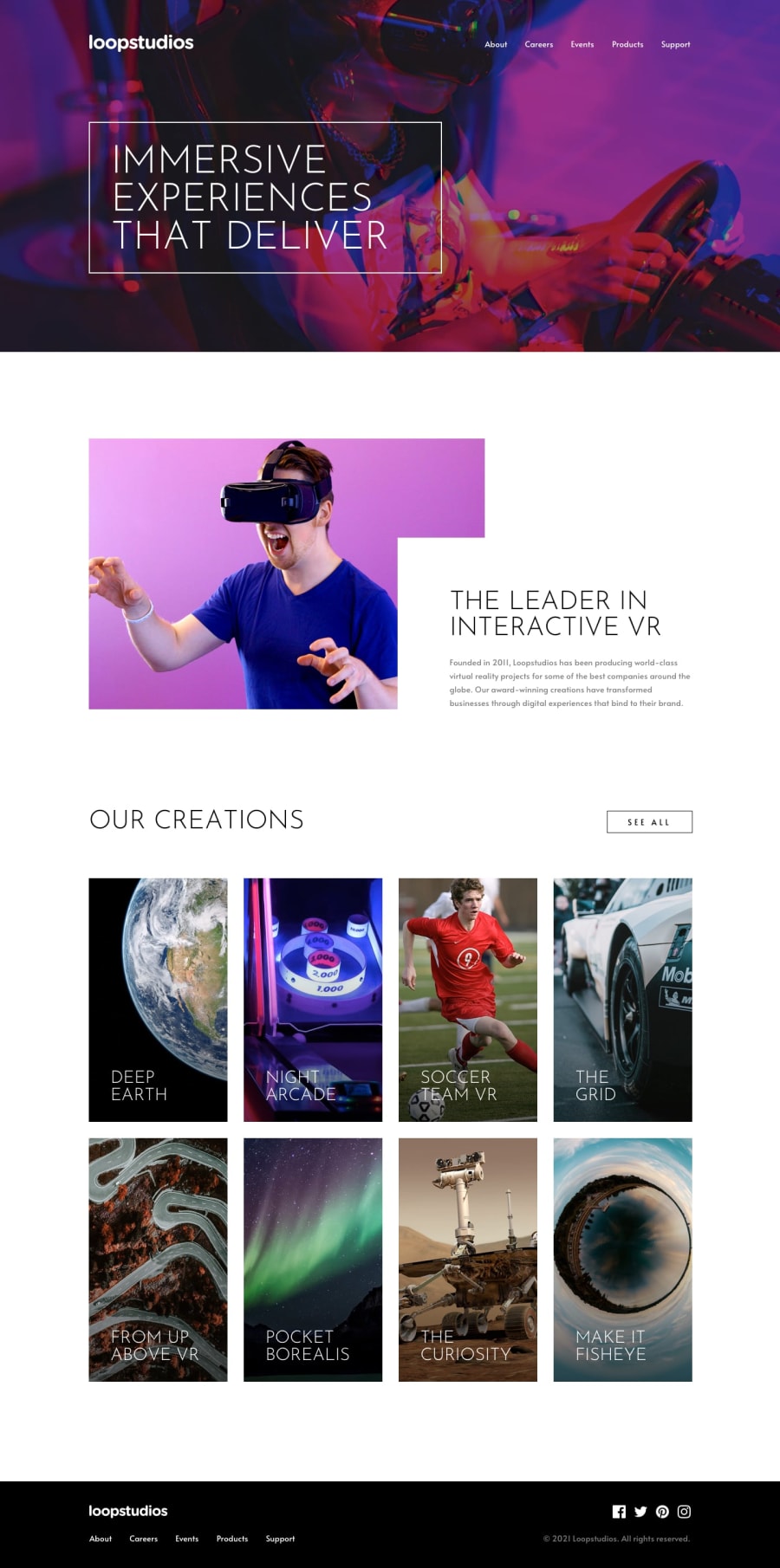
Design comparison
SolutionDesign
Solution retrospective
Any feedback is appreciated :)
Community feedback
- @tedikoPosted over 3 years ago
Hello, Tejas! 👋
Good job on this challenge! Your solution responds well and looks nice. Some tips from me:
- Since your
.logoimage is decorative youralttext should be provided empty (alt="") so that they can be ignored by assistive technologies, such as screen readers. But, It'd be a good idea to make logo clickable, so wrap your logo into anchor tag and then change alt text to more descriptive like "Loopstudios - home page". - I write about it in your last solution, but I think you forgot about it. - Add
:focuspseudo class to interactive elements like anchors, buttons etc. Useoutlineproperty to make your website more accessible to keyboard users. Focusable elements like anchor, buttons or inputs they have applied default:focuspseudo class withoutlineproperty. These default styles are subtle and hardly visible tho. Furthermore every browser has a slightly different default style for the outline, so you probably want to change the default style. Read more about why we should change focus styles.
Good luck with that, have fun coding! 💪
0@Tejas-117Posted over 3 years ago@tediko I completely forgot about focus and outline, thanks for reminding :)
0 - Since your
Please log in to post a comment
Log in with GitHubJoin our Discord community
Join thousands of Frontend Mentor community members taking the challenges, sharing resources, helping each other, and chatting about all things front-end!
Join our Discord
