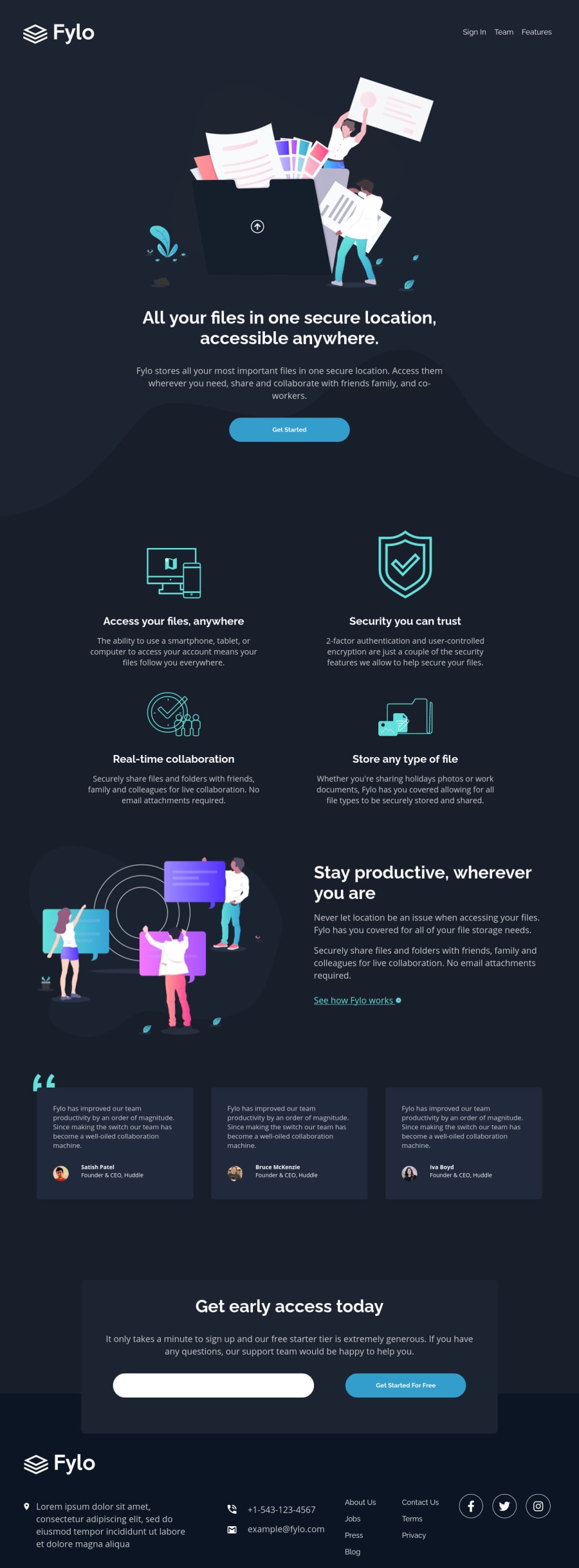
Design comparison
SolutionDesign
Solution retrospective
A lot of work made here. Done the email validation with Js.
Community feedback
- @tedikoPosted over 3 years ago
Hello, TrakaMeitene! 👋
Congratulations on finishing another challenge! What i would suggest is:
- You set your
font-sizeto view width. This is causing that on my resolution 1920px x 1080px font-sizes are huge. Try to fix that. - Since your
.logo,Intro illustration,logsimages are decorative youralttext should be provided empty (alt="") so that they can be ignored by assistive technologies, such as screen readers. - Your site logo isn't clickable. It'd be a good idea to make the page refresh or scroll to the top when you click it. If you change it to be clickable, you can keep your alternative text on that element, but change it to maybe "Huddle - home page" or something similar.
- Add
:focuspseudo class to interactive elements like anchors, buttons etc. Useoutlineproperty to make your website more accessible to keyboard users. Focusable elements like anchor, buttons or inputs they have applied default:focuspseudo class withoutlineproperty. These default styles are subtle and hardly visible tho. Furthermore every browser has a slightly different default style for the outline, so you probably want to change the default style. Read more about why we should change focus styles. - Add some
aria-labels for yoursocanchor tags to let screen readers know what kind of link is that.
Good luck with that, have fun coding! 💪
2@TrakaMeitenePosted over 3 years ago@tediko Thank you very much for your feedback.
Ha, I did thought about the border on my input element, tried to make it dissapear, but my son interrupted me and I forgot to take deeper research on it. Thank you :)
0 - You set your
Please log in to post a comment
Log in with GitHubJoin our Discord community
Join thousands of Frontend Mentor community members taking the challenges, sharing resources, helping each other, and chatting about all things front-end!
Join our Discord
