Design comparison
Solution retrospective
Greetings to all
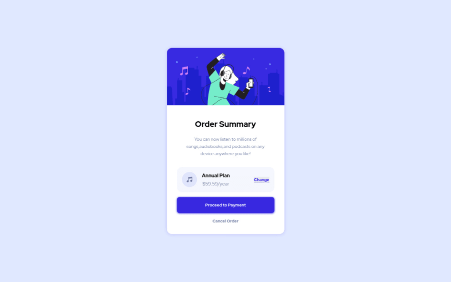
heres my solution.
Still in need for some modifications ,but pretty much thats it .
Cheers !
Community feedback
- @vanzasetiaPosted about 3 years ago
Hi There! 👋
Congratulations on finishing this challenge! 👏
@dewslyse has given some incredible feedback for you. Here is some feedback from me:
- Accessibility
- For any decorative images, each
imgtag should have emptyalt=""andaria-hidden="true"attributes to make all web assistive technologies such as screen reader ignore those images. In this case, all icons and images are decorative only. - Next time, if you write alternative text for images, it should not be hyphenated. The user of assistive technology relies on alternative text to know the image content. So, it's recommended to make it human-readable and informative.
- Create a custom
:focus-visiblestyling to any interactive elements (button, links,input,textarea). This will make the users can navigate this website using keyboard (by usingTabkey) easily.
- For any decorative images, each
- Styling
- To make all the elements
box-sizing: border-boxdo the following.
- To make all the elements
html { box-sizing: border-box; } *, *::after, *::before { box-sizing: inherit; }- I would recommend changing the
width: 375pxtomax-width: 23.5rem. Currently there's a horizontal scrollbar on my mobile view (360px * 640px). - Also, I would recommend adding some
paddingon thebodyelement to prevent the card from touching the browser edges. - Always use classes to reference all the elements that you want to style. Using
idis going to make your stylesheet have high specificity (hard to maintain).
That's it! Happy coding! 😁
Marked as helpful1 - Accessibility
- @dewslysePosted about 3 years ago
Hello @thanosballo, congrats on your submission. Well implemented. Some things to note:
- Remember to include landmarks (e.g.
header,main,footeretc) in your markup. In this case you could change<div class="container">to<main class="container">. - Make sure headings increase by one. You could change
<h4>Annual Plan</h4>to<h2>Annual Plan</h2> - The order summary component is missing the background image
Happy coding!!
Marked as helpful1 - Remember to include landmarks (e.g.
- @GitHub-dev12345Posted about 3 years ago
Reduce the accessibility changed this code:
1.<div class="container"> to <main class="container">
this code usefull for you, click on the marked as helpful
0 - @GitHub-dev12345Posted about 3 years ago
used this CSS Property in your card to increase and decrease the size of card:
1.In Card design CSS Code Used this:
transform : scale(0.8); this property decrease the size of card. 😉
large size for increase the number of scale & small size for decrease the number of scale
And used this code for background image : In body tag used this CSS property: body{ background : url("./images/uesd image path") no-repeat; background position: top center; background size: 100% 50%; ( this is your choice check the image performance, and the gave the size percentage on your choice); this code very helpful for your background image😉😎 keep it up; } this code helpful for you, plz click on the mark the helpful
0
Please log in to post a comment
Log in with GitHubJoin our Discord community
Join thousands of Frontend Mentor community members taking the challenges, sharing resources, helping each other, and chatting about all things front-end!
Join our Discord
