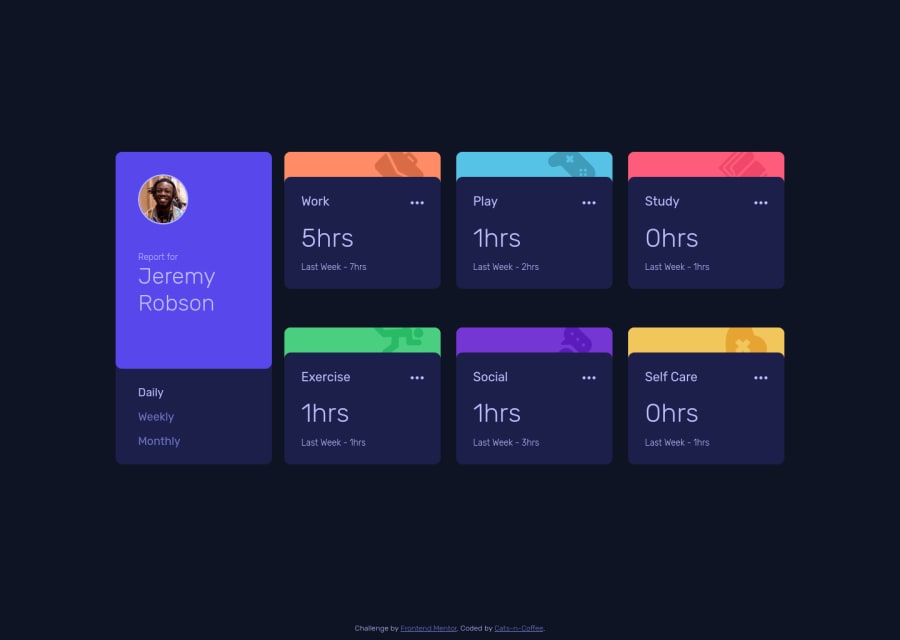
Design comparison
Solution retrospective
Hi everyone!
I generated the dashboard cards using Js for a couple reasons: it's fun, it avoids HTML duplication and bloated CSS selectors in the script, and I found it easier to update and fill the Json data.
I haven't done a vanilla Js project in a while, so I will take any advice on code structure and/or events and handlers organization.
I also couldn't find a solution for the CSS grid I used on the body to keep the main using all the space and the footer to use only what it needs, so I added a media query instead. Any suggestions on grid property(ies) to keep the footer at its minimum height for the desktop and mobile version? (media query was added to achieve this on desktop).
Thank you all!
Community feedback
Please log in to post a comment
Log in with GitHubJoin our Discord community
Join thousands of Frontend Mentor community members taking the challenges, sharing resources, helping each other, and chatting about all things front-end!
Join our Discord
