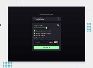
Design comparison
SolutionDesign
Solution retrospective
What are you most proud of, and what would you do differently next time?
I think this is some of the worse JS code I've ever written, it's super messy and not clear in places but it works. If I have time I'd like to refactor the code to make it more clear.
What challenges did you encounter, and how did you overcome them?Loads of challenges, mainly how to update the strength icons.
What specific areas of your project would you like help with?Is there any easy way to display error messages besides window.alert?
Community feedback
Please log in to post a comment
Log in with GitHubJoin our Discord community
Join thousands of Frontend Mentor community members taking the challenges, sharing resources, helping each other, and chatting about all things front-end!
Join our Discord
