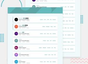
Design comparison
SolutionDesign
Solution retrospective
Feedback would be appreciated! Cheers!
Community feedback
- @HikmahxPosted over 2 years ago
Hi, @AmanpreetSingh1995. Great work! I'd like to make a few suggestions.
- When hovering on a skill, close or clear button, it's better to make the cursor pointer.
- I think there should be a bit more padding-bottom in the body. Maybe like 3-4rem.
- I think it would be better to avoid making the site reload every time the clear button is clicked.
Marked as helpful2@AmanpreetSingh1995Posted over 2 years ago@Hikmahx absolutely right points, thank you!
0
Please log in to post a comment
Log in with GitHubJoin our Discord community
Join thousands of Frontend Mentor community members taking the challenges, sharing resources, helping each other, and chatting about all things front-end!
Join our Discord
