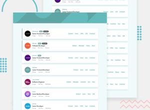
Design comparison
SolutionDesign
Solution retrospective
I'd really appreciate any feedback. Thank you!
Community feedback
- @HikmahxPosted over 3 years ago
@hafizanadli I have fixed the code. Thanks for your feedback.
0 - @hafizanadliPosted over 3 years ago
What a superb work you've done!
There is a small things that should be fixed. when the jobs list is too long, it will overlap its parent container when in mobile view. For example the eyecamp part.
Other than that, it's almost similar to design.
Keep up the great work!
0@HikmahxPosted over 3 years ago@hafizanadli thanks for your feedback. I'll try to rectify it.
0
Please log in to post a comment
Log in with GitHubJoin our Discord community
Join thousands of Frontend Mentor community members taking the challenges, sharing resources, helping each other, and chatting about all things front-end!
Join our Discord
