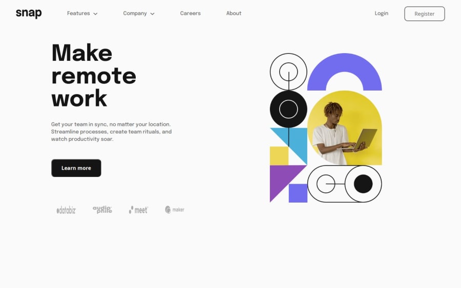
Design comparison
SolutionDesign
Community feedback
- @UDsGitHubPosted 4 months ago
Take a look at my recent solution for this. Ignore the semantic issues, I will correct them soon enough. Some things I would like to comment on about your solution include:
- I assume you didnt get the figma design file just like me, but your spacing seems waay off. If you are using windows system, try downloading this app called PowerToys. It is useful for color picking, pixel measurements and more. I used it to get measurements for somethings in the design pictures and got a rough idea on what the sizes of things were.
- Might want to have transition duration on your interactive hover elements.
- Using an image for the svgs was the right call, but you dont exactly want to be specifying width and heights on the images, cuz that locks you into positions you dont want to be in, especially with this design. Setting a height was fine, but you would rather have 100% width on the svg images. For mine, I had them in divs, and the images set to object fit contain and let flexbox handle the sizing of the divs.
Hope this helps
Marked as helpful1@SierLorPosted 4 months ago@UDsGitHub Thank you very much for your recommendations. I will keep them in mind in the future!
0
Please log in to post a comment
Log in with GitHubJoin our Discord community
Join thousands of Frontend Mentor community members taking the challenges, sharing resources, helping each other, and chatting about all things front-end!
Join our Discord
