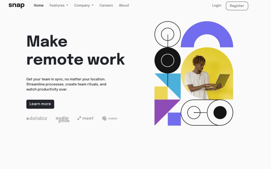
Design comparison
Solution retrospective
I find it difficult to separate the navigation between the home navigation and login navigation. Then idea strike to my head to create new navbar wrapped inside div. Question i want to ask
- I confuse when to use min-width and max-width so i just opt for max-width on everything. When should i use min-width?
- I have few breakpoint in my css, is it better to add media query when things not looking good on certain resolution or have media query specific for device like phone, tablet, laptop, big screen?
- Since i don't use javascript, is it better to use javascript in this project? maybe to replace some bootstrap behavior
Community feedback
- @DonUggioniPosted over 2 years ago
Hey there,
You could get rid of the home button, instead, you see a lot of pages that when you click on the logo, it takes you back to the home page.
Personally, and I have seen other developers do, I use the min-width when dealing with the smallest width possible for mobile devices, and max-width for bigger screensizes so it doesn't expand too much.
Regarding media queries, I like to take the approach of, if it's not looking good, I will change it, no matter what, that's because even on phones and tablets, the screen sizes may vary quite a bit. It's always good to have a screen size range in mind though, but I think your approach makes sense.
Not sure about mixing bootstrap and javascript, I don't know if it could create conflicts. I'd go with either one or the other.
Hope it helps!
Marked as helpful1
Please log in to post a comment
Log in with GitHubJoin our Discord community
Join thousands of Frontend Mentor community members taking the challenges, sharing resources, helping each other, and chatting about all things front-end!
Join our Discord
