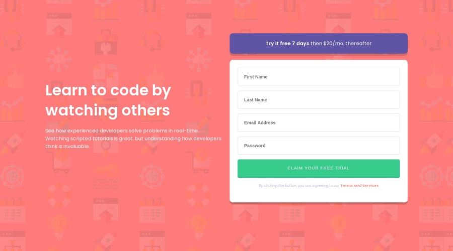
Intro component with sign-up form in HTML, SASS & JavaScript
Design comparison
Solution retrospective
I would love any feedback you can give, especially how I can use more of SASS' features in my code. I feel like all I am really using is the nesting feature so I'm curious if I should revert back to normal CSS for small projects like this?
Community feedback
- @AceKahunaPosted over 4 years ago
Hey there Ben, checked out your code and it looks fine. No need to worry about nesting since it helps out define the properties much efficiently and helps avoid making mistakes while calling a certain class or an element in vanilla CSS. On the media queries, you can create a
@Mixininstead of having to write the code manually.@mixin tab-land{ @media screen and (min-width: 992px) { @content; } }Set a
min-widthandmax-widthfor the elements to avoid it squishing in the mobile view1@BenSeagravePosted over 4 years ago@kahunaako10 Thanks for your swift reply.
Could you please explain to me the benefits of writing the media queries with the mixin instead of css. Please tell me if I am wrong, but the only benefit I can see is that instead of writing the full media query in my SCSS, I can instead write it somewhere more hidden (another file or top/bottom etc) and then write a shorter syntax to include the same code.
Seeing as the difference is between:
@media only screen and (min-width: 992px) {
    body {
        background: red;
    }
}
and :
@include desktop-break {
    body: background: red;
}
I struggle to see the benefit for one single query. If however, I was to add an argument to the mixin so I could dynamically change the breakpoint dimensions, this would seem like it may be worth the extra code.
Thanks again for your reply and sorry for the long winded response. I just want to make sure I get your point so I can be sure to use it correctly in the future!
Again this may just be me being incorrect so please tell me if so.
1@AceKahunaPosted over 4 years agoUsing the Mixin is helpful since instead of writing the media queries at the bottom you can easily write them within the element. For example,
body{
    background-image: url('/images/bg-intro-mobile.png');
    background-repeat: no-repeat;
    background-color: $primarycolor;
    overflow-x: hidden;

    @include responsive(tab-port){
        display: flex;
        align-items: center;
        flex-direction: column;
        max-width: 100%;
        background-size: cover;
    }
}
for the case above you include the mixin within the element to avoid having to scroll each time to confirm the properties. You can create an SCSS file to contain the media queries breakpoints to efficiently work it. Check out my media queries file.
1@AceKahunaPosted over 4 years ago@kahunaako10 it's within the body element tried editing It but still, it won't display
0@BenSeagravePosted over 4 years ago@kahunaako1 Great explanation, thanks!
I'll be sure to use your example in my future projects.
0
Please log in to post a comment
Log in with GitHubJoin our Discord community
Join thousands of Frontend Mentor community members taking the challenges, sharing resources, helping each other, and chatting about all things front-end!
Join our Discord
