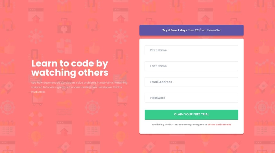
Intro component with sign up form solution
Design comparison
Solution retrospective
Hi! 👋 This is my solution to this challenge
If you have any suggestions/tips, feel free to comment :D
Community feedback
- @AchrefFastPosted over 2 years ago
Hey Cosmo , nice work on this one. The layout for both desktop and mobile is great. The hover states look nice as well. The error message when there are any input fields empty works fine.
There is only one thing I guess you forget: the error message when the email address is not formatted correctly. When I write an invalid email format, a message error should show up.
Overall, great work. Keep it up.
Happy coding.
Marked as helpful1@cosmoartPosted over 2 years ago@AchrefFast Hi Achref!, Thanks for the suggestion, I hadn't forgotten that validation, I just forgot to change a selector (It was just changing "mail" to "email" 😅). Now it works perfectly!
Also take the opportunity to style the scroll bar 😉
1
Please log in to post a comment
Log in with GitHubJoin our Discord community
Join thousands of Frontend Mentor community members taking the challenges, sharing resources, helping each other, and chatting about all things front-end!
Join our Discord
