

Design comparison
SolutionDesign

Solution retrospective
Any feedback on CSS and JS
Community feedback
- @Dharmik48Posted over 3 years ago
Hey👋,
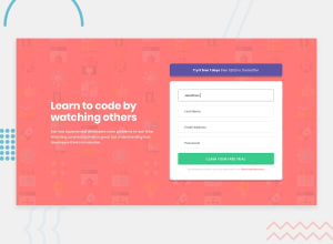
Good job with the solution! But here are some things you can improve on:
- Instead of
text-align: center;make ittext-align: left;to the lefth1andpelements on left. - Change the
colorof theinputbecause when I type I can't see the text as it the same color as the input background. - Add
cursor: pointerto all the buttons and links with some hover effects and transition.
Apart from these your solution is really good, keep it up👍
Marked as helpful1@VishRoyPosted over 3 years ago@Dharmik48 Hi ,
Thank you so much for your suggestions ! I'll implement all of them in my code
0 - Instead of

Please log in to post a comment
Log in with GitHubJoin our Discord community
Join thousands of Frontend Mentor community members taking the challenges, sharing resources, helping each other, and chatting about all things front-end!
Join our Discord