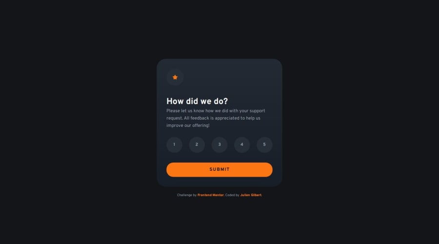
Interactive_rating_component_TypeScript_Accessibility
Design comparison
Solution retrospective
This project allowed me to deepen my knowledge of TypeScript and web accessibility. Here are some key takeaways:
- Object-Oriented Programming in TypeScript: I structured the code using a class, which improved the organization and maintainability of the code.
- Advanced Accessibility: I implemented ARIA attributes and managed focus to ensure an inclusive user experience.
- Error Handling: I added an accessible error handling system to improve user feedback.
- Responsive Styles: I created styles that adapt to user preferences, including for motion reduction.
no particular difficulties with this project
What specific areas of your project would you like help with?Let me know if you see anything that i can improve, thank you :)
Community feedback
- @Devs-advocatePosted 6 months ago
Really nice solution Gilbert. The dimensions are near perfect. The functionality is good too with your implementation of an error message. I like your use of typescript which is something I'm learning at the moment. Your accessibility features looked more than adequate as well.
0
Please log in to post a comment
Log in with GitHubJoin our Discord community
Join thousands of Frontend Mentor community members taking the challenges, sharing resources, helping each other, and chatting about all things front-end!
Join our Discord
