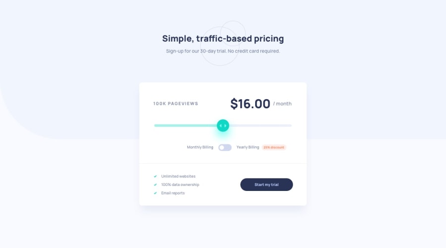
Design comparison
Community feedback
- @Moyo75Posted almost 4 years ago
On mobile:
-
The subtexts in the header should be displayed vertically, not inline. You used one paragraph element, but you might want to make it two and give their appropriate displays. Since you used flexbox, you could try
flex-direction: column. -
The elements and texts in
<div class="details-type"></div>should be in one line. This is party due to thepaddingin<div class="card-body"></div>and also the font sizes of the elements in<div class="details-type"></div>.
General:
- Your slider is not hooked up with the pageviews count and your toggle button is also not hooked up with the pricing amount to effect the discount. You might want to check your JS.
You can get your app to look and behave more as described in the project requirements when you fix this issues. Lemme know what you think!
1 -
Please log in to post a comment
Log in with GitHubJoin our Discord community
Join thousands of Frontend Mentor community members taking the challenges, sharing resources, helping each other, and chatting about all things front-end!
Join our Discord
