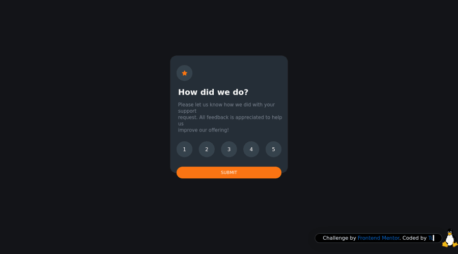
Interactive Rating Component Sass/Scss & JS
Design comparison
Solution retrospective
Hi, I am Tux3er 🐧
It was an easy challenge to practice my JS skills,
I also put an dark/light ☀️/🌙 mode in the page!
Community feedback
- @ApplePieGiraffePosted about 2 years ago
Hey, Ismail Hammaini Farhane / Tux3er! 👋
Well done on this challenge! 👍 I like the extra touches that you added to your solution! 👏
It would be good to use
buttonorinputelements for the options in the card component. You are currently usingtabindexto make thelielements keyboard-focusable, which is generally discouraged as using semantic, interactive elements from the start is a better way to go. The options would be a good opportunity to use radio input elements since only one option can be selected at a time. You can also wrap the input elements and submit button in aformelement and collect the form data by listening for thesubmitevent on the form in your JS. 😉Adding some form validation to the card would be a nice idea, too, in order to make sure that users select an option before submitting the form. 🙂
Hope you find this helpful. 😊
Keep coding (and happy coding, too)! 😁
Marked as helpful1 - @alexgabriel8Posted about 2 years ago
Wow, your project is really beautiful. Using the star as a way of toggling between light/dark mode was really creative and the animations just make it even better.
One thing I think would make your project even better is to put a
cursor: pointer;in the star and in the "go back" arrow icons. Your screenshot also seems to be outdated, with the submit button in a strange location.Marked as helpful0@Tux3er-IsmaPosted about 2 years ago@alexgabriel8
Hi alex
Thank you for your comment, but I have put all the hover states with a
cursor: pointer;can you tell me the specific tag please.Thank you alex Tux3er is happy 🐧
1@alexgabriel8Posted about 2 years ago@Tux3er-Isma Using the Goggle Chrome's inspector, I have placed
cursor: pointer;in.main .main__card .main__card__mode-containerand.main .main__submit .main__submit__returnand I had good results.Another feedback would be to press on "Generate new screenshot" in this page. Because your current screenshot seems to be of an older version of your project.
Marked as helpful0
Please log in to post a comment
Log in with GitHubJoin our Discord community
Join thousands of Frontend Mentor community members taking the challenges, sharing resources, helping each other, and chatting about all things front-end!
Join our Discord
