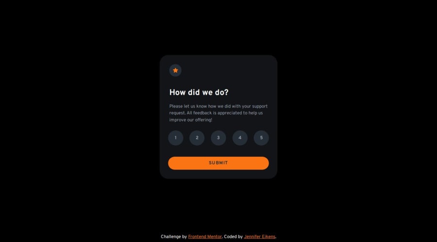
Interactive rating component built with React
Design comparison
Solution retrospective
I am most proud of how I improved my understanding of React as I built this project, as it was my first React app. Next time, I think I would use React-Bootstrap rather than plain CSS and use Sass for my CSS as I found myself applying a lot of the same properties to different elements.
What challenges did you encounter, and how did you overcome them?As for the actual coding part, I struggled most with the proper use of state variables to make my components work together. I went back to the React documentation and read through the chapters on conditional rendering and the use of state variables, and I did some of their practice exercises to improve my understanding. It also took me a while to figure out the responsive design. I initially tried using width, min-width, height, and min-height to ensure proper proportions but the layout always ended up getting messed up on smaller screens. Applying an apsect-ratio eventually fixed that problem. Overall though, the deployment process was most difficult for me. I spent several afternoons/evenings fixing issues. The problem was that because I built the project with React, I encountered some React-specific issues during the process of building the app and pushing to Git. As I had no prior knowledge of Git, this was quite a challenge. I found myself looking up one error message after another that popped up in my terminal. In the end I managed to get it up and running though.
What specific areas of your project would you like help with?I think functionality-wise, my app should work just fine. Currently, the only slight issue I'm aware of is that when I open the live site on my cell phone and rotate the screen (so that it's wider than it is high), the top of the rating card gets cut off slightly. So I'm thinking I might need to add a media query to add a margin-top for this scenario. Also, I know I didn't get the colors right. The thing is, the style guide file only lists three colors other than white and orange, which doesn't work out because from the design pictures provided, it looks like there need to be at least four shades of black/blue/dark gray. This is also what color extraction tools that I put the pictures into told me. I would like to know how others approached this (did you stick to the colors provided by the style guide or did you extract the colors from the pictures and use those)?
Join our Discord community
Join thousands of Frontend Mentor community members taking the challenges, sharing resources, helping each other, and chatting about all things front-end!
Join our Discord
