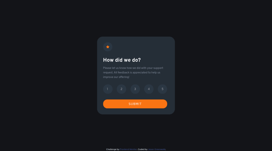
Interactive Rating Card using Flexbox, JavaScript
Design comparison
Solution retrospective
I suspect there is more than one way to style the radio buttons. I wasn't totally satisfied with my solution.
Please just look it over and let me know what you think.
Community feedback
- @Sdann26Posted over 2 years ago
Hi Jason!
I would recommend you to add a few small details, like adding the letter-spacing: 2px attribute to the SUBMIT button. With this you would generate that separation that comes out in the design.
I would also recommend adding transition to all the buttons or links that have a change of state that alters the background colors, font color, size, position, etc. Adding to these elements for example transition: all 250ms. This will make your projects look more professional.
I hope these recommendations will help you apart from the one given in the previous message.
Good Luck!
Marked as helpful1@jaycgreenwaldPosted over 2 years ago@Sdann26 Thank you for taking the time to provide some feedback. The devil is in the details, right? I'm going to make the changes you suggested and keep the transition idea in mind going forward. I appreciate the help. Cheers!
0@Sdann26Posted over 2 years ago@jaycgreenwald Exactly, always trying to make things as equal as possible, and later will come more complicated things because they must be adapted to all types of devices, where you have to keep in mind whether mobile, tablet, desktop or TV.
Good Coding!
0 - @tesla-ambassadorPosted over 2 years ago
Hey Jason. Congrats on completing this challenge it's really smooth and responsive! You might not want to use the
autocompleteattribute on your radio buttons as this works for a specific input types so instead of setting it to off, you could just leave it out. This will reduce your HTML validation errors.Autocomplete is only allowed when the input type is color, date, datetime-local, email, hidden, month, number, password, range, search, tel, text, time, url, or week. Happy coding and keep up the great work.
Marked as helpful1@jaycgreenwaldPosted over 2 years ago@tesla-ambassador Thank you for the feedback. I had no idea about the autocomplete attribute - I just knew it fixed my problem. I'll look into another option. I appreciate the help. Cheers!
1 - @RajSanjelPosted over 2 years ago
Everything is great but if user doesn't select any rating then it should have default value of (1 or 0 ) or you should send alert saying select atleast one to proceed. Others looks perfect.
0
Please log in to post a comment
Log in with GitHubJoin our Discord community
Join thousands of Frontend Mentor community members taking the challenges, sharing resources, helping each other, and chatting about all things front-end!
Join our Discord
