

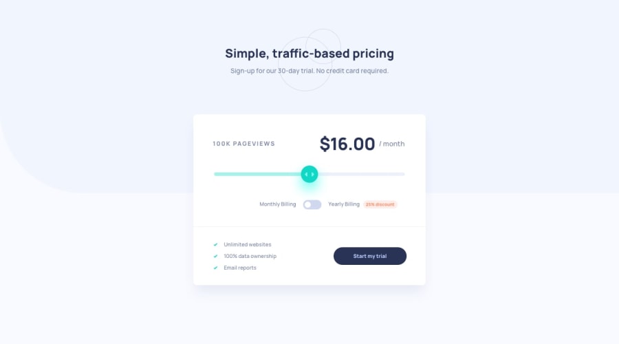
Design comparison
Solution retrospective
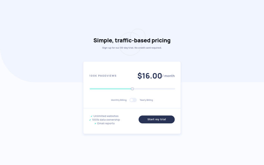
Made with Vue along with Grid and Flexbox and SCSS.
Most annoying part was the range styling.
Feedback is always appreciated! ;)
Community feedback
- @Sam-GulikerPosted almost 3 years ago
Hi, Nerijus
Looks good but there are a couple of things design-wise that needs some attention.
- The text on the bottom left should be aligned left.
- Where did the discount go?
Happy coding
1@NerijusNoreikaPosted almost 3 years ago@Sam-Guliker I changed the discount logic by design. The toggle slides to the right, instead of left for discount ;) To me it looked better
For text alignment, my bad, I noticed that on mobile it should be aligned center, and did not account for desktop version. Thanks for observation :)
1 - @elroytoscanoPosted almost 3 years ago
Well done. Pixel perfect design. Whenever you use form elements, use a label tag as it facilitates accessibility.
Download AXE dev tools so that you can clear any accessibility issues while coding : https://www.deque.com/axe/devtools/
1


Please log in to post a comment
Log in with GitHubJoin our Discord community
Join thousands of Frontend Mentor community members taking the challenges, sharing resources, helping each other, and chatting about all things front-end!
Join our Discord