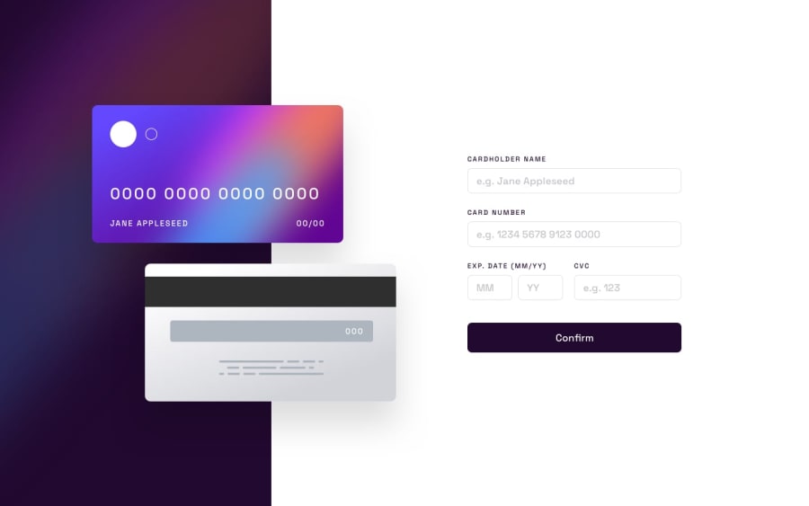
Design comparison
Solution retrospective
Hello 👋👋 frontendmentor community
-
this is my solution to the
interactive card details, it was really an amazing project during which I learned git 😁, and finally used JavaScript to my satisfaction all from scratch...., it took months just to understand the syntax and now am toggling classes ^_^. -
Currently my solution might have some accessibility issues. but will look into it soon enough and it's not pixel which am not happy of but anyways... I will really appreciate any helpful tips and recommendations from the community on how to make it more interactive and more accessible. THANKS @frontendmentor
Community feedback
Please log in to post a comment
Log in with GitHubJoin our Discord community
Join thousands of Frontend Mentor community members taking the challenges, sharing resources, helping each other, and chatting about all things front-end!
Join our Discord
