insure-landing-page-master/ html/css/javascript/bootstrap-5
Design comparison
Solution retrospective
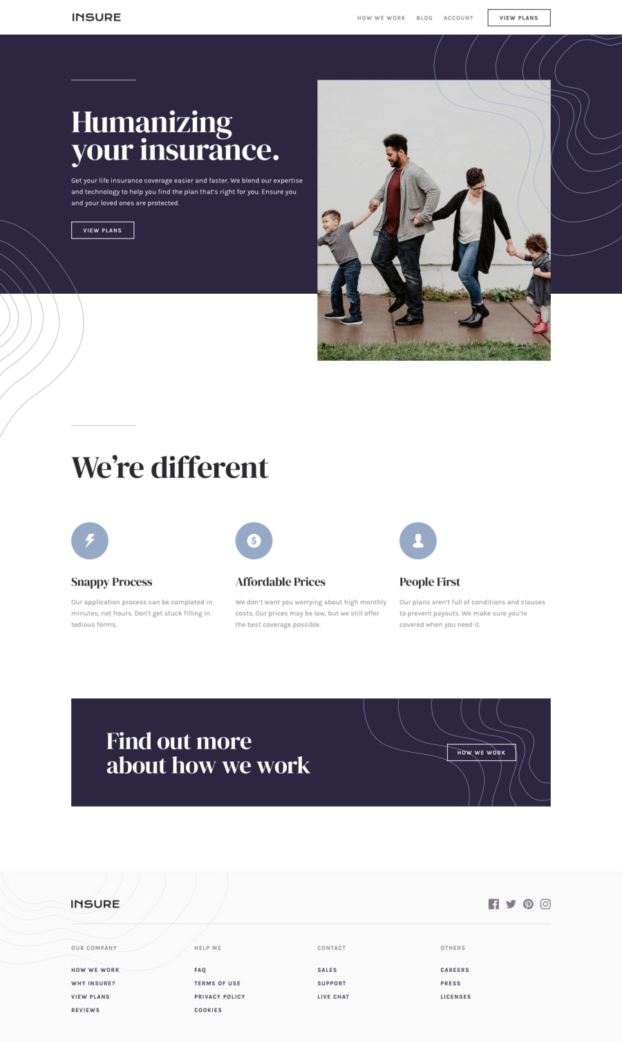
Great challenge, not easy, which is good for learning CSS skills. I used mostly the bootstrap 5 library in combination with native CSS and a bit of javascript for mobile nav. Any comment is welcome.
Community feedback
- @skyv26Posted almost 3 years ago
Hi! Salko, I noticed some issues.
-
When i hover on navigation menu (view plans) then your menu items moves slightly back and forth.
-
You middle section contents are not aligned properly.
-
When I hovered on social media icons then it looks weird on hover effect, a kind of black
background appears and taking more space then its content. -
Make sure when someone click on menu then that menu takes user on that particular section.
I really liked your efforts that you had put by making it responsive.
Overall 7/10
Good Luck
Marked as helpful0 -
- @sarajlijaPosted almost 3 years ago
Number 2 is a problem related to the settings on my browser, 1st 3rd and 4th are my fault, I will fix that. Thanks a lot for the advice.
0
Please log in to post a comment
Log in with GitHubJoin our Discord community
Join thousands of Frontend Mentor community members taking the challenges, sharing resources, helping each other, and chatting about all things front-end!
Join our Discord
