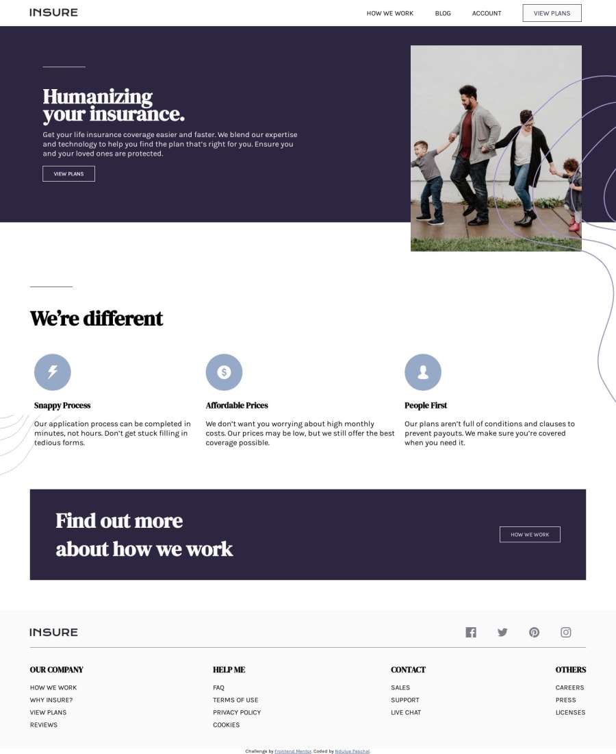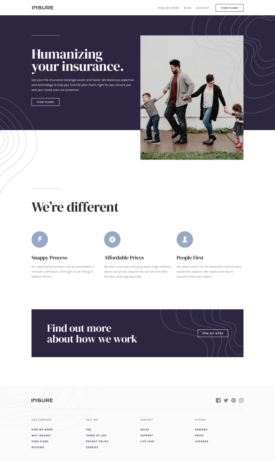
Design comparison
Solution retrospective
On using image overlays,to keep track of this,is it ideal to write multiple media queries?... or is there a better way to go about it???
Community feedback
- @emestabilloPosted about 4 years ago
Hi @Adechukwu, not sure if there is an actual standard, but I think it depends on the design. I'm also currently working on this project and I didn't have to write media queries for the background patterns. I tried to match the mobile and desktop design, and for medium widths I'm doing it by eye. You can certainly write media queries, as you have, to control the widths and overall aesthetic of the project. Just a side note: the hover states are missing on the nav and footer links, and the mobile menu is pushing the main content down when it's open. Hope this helps :-)
2 - @HaybukaPosted about 4 years ago
Thanks it did help...i'd love to see your finished work when its done,i hope to clarify some doubts i have concerning positioning... Thank you
1
Please log in to post a comment
Log in with GitHubJoin our Discord community
Join thousands of Frontend Mentor community members taking the challenges, sharing resources, helping each other, and chatting about all things front-end!
Join our Discord
