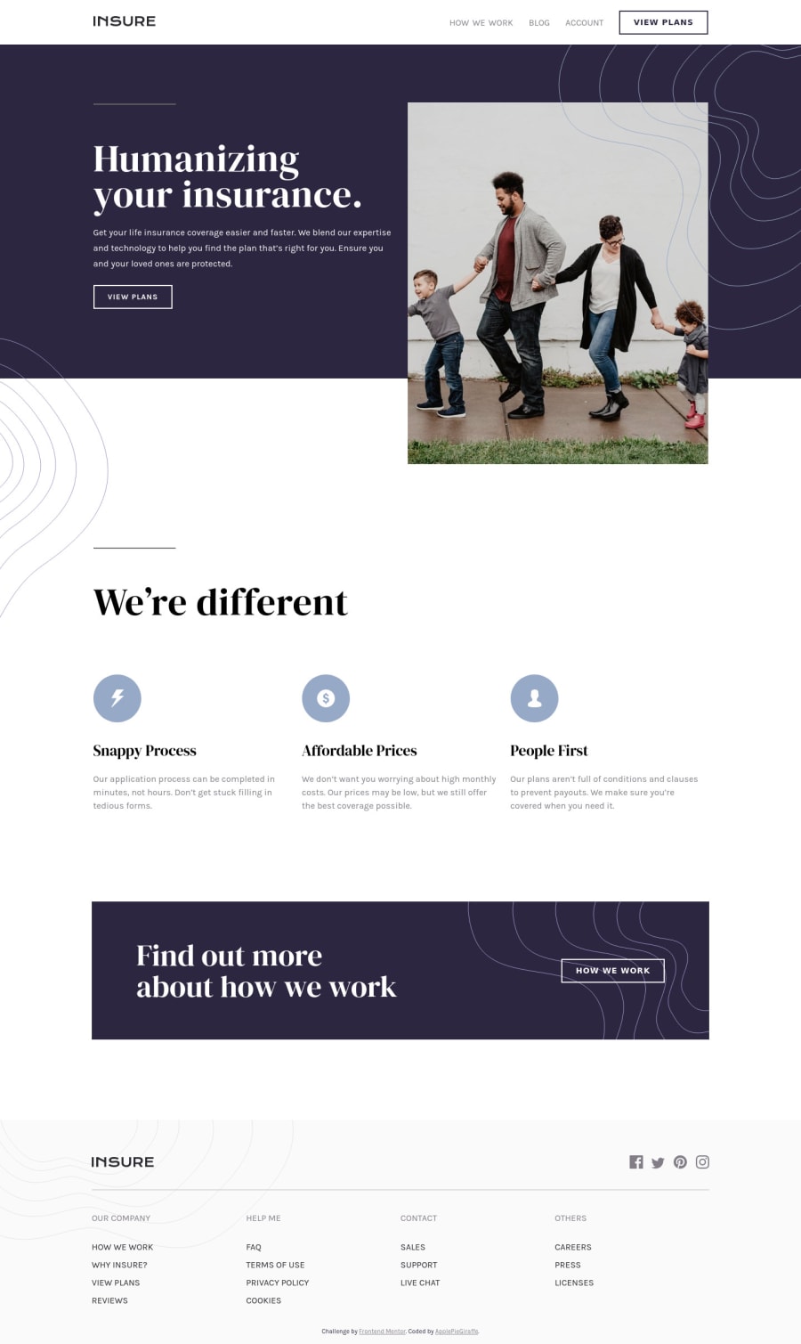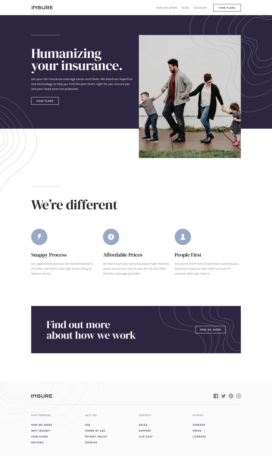
Insure Landing Page With Responsive Mobile Navigation
Design comparison
Solution retrospective
Hey, everybody! 👋
This was a fun challenge from which I learned a lot!
This was my first time coding a responsive mobile navigation (which turned out to be a little easier than I thought) and I'm quite pleased with the result (that is, if it works for you as well as it did for me 😆)!
I also got to practice using CSS grid a little more and think carefully about how I wanted the page to be responsive. 🧐
Of course, feedback is welcome and appreciated! 😊
Happy coding! 😁
Please log in to post a comment
Log in with GitHubCommunity feedback
- @thomasjonstrup
Really beautiful solution that looks just like the design, i like how the content is placed just like the design and how clean it is in the dom. Very good job.
- @artimys
You've outdone yourself here @ApplePieGiraffe 🙌. It looks awesome.
Well used semantics, clean css, responds great and I saw aria support on the hamburger menu 👍. My favorite part is how the picture tag responds in the header.
Keep it up!!
- @emestabillo
Hey APG! Seems I'm a couple of days late lol. Just dropping by to give a thumbs up for this project. You're ready for intermediate :-)
- @brasspetals
Looks great to me! I really like the animation styles on the mobile navigation - feels very smooth and goes well with the overall design and feel of the page, and the whole thing responds beautifully. Awesome job! 🙌
Join our Discord community
Join thousands of Frontend Mentor community members taking the challenges, sharing resources, helping each other, and chatting about all things front-end!
Join our Discord
