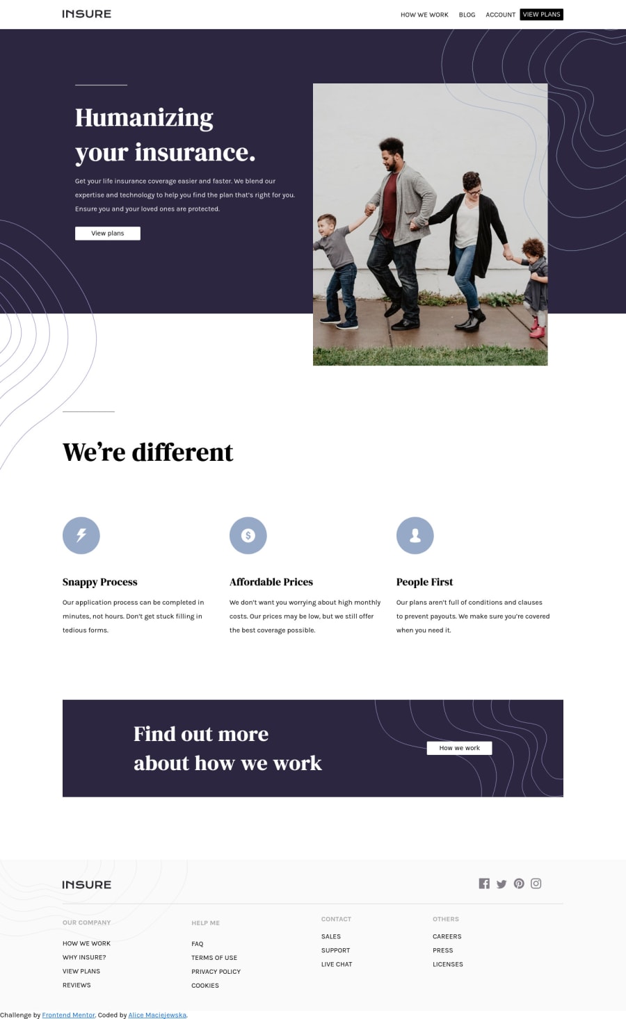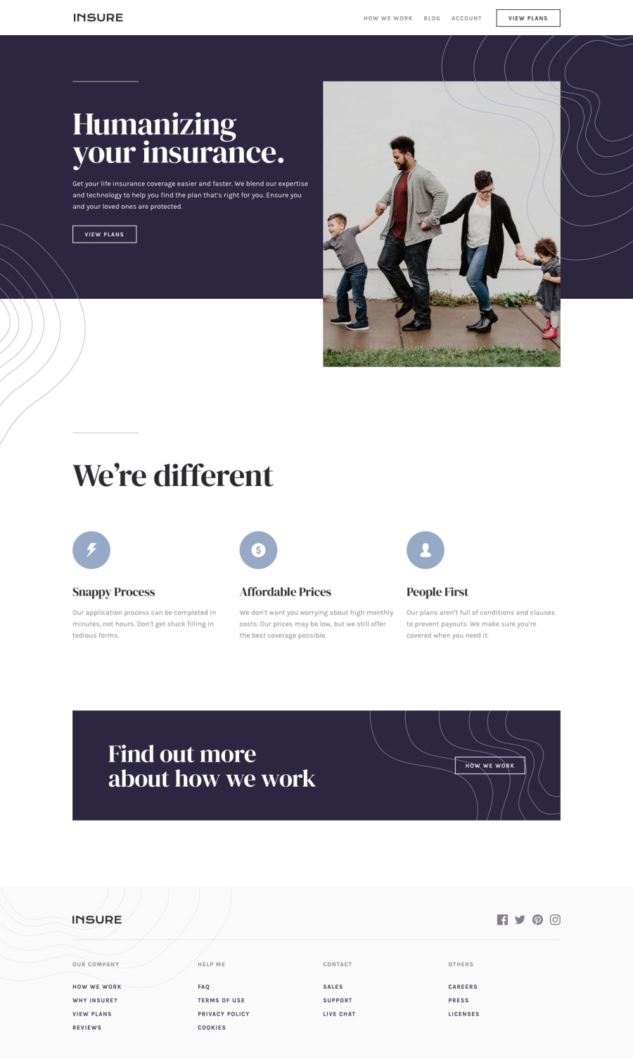
Insure landing page with CSS flex layout and vanilla JS
Design comparison
Solution retrospective
This is my first fully done landing page.
I feel like my responsivity is all over the place, any tips on improving that?
- Im really struggling with layout of absolute images and background images, any feedback on that?
Thank you guys! I really appreciate it!
Community feedback
- @emestabilloPosted almost 4 years ago
Hi @alicemac93, congrats on your first landing page!
-
Perhaps the first suggestion I have for responsive layout is to go with mobile-first. It's easier to make elements scale up rather than make them fit in smaller widths.
-
I'd also be aware of how they look and make adjustments at each breakpoint you declare. At 481px, for example, the header and the footer elements look squished or out of proportion. It'd probably be best to wait for wider widths before these elements are side by side.
-
The wavy patterns are decorative only, so better to apply them as a
::beforeor::afterpseudo elements rather than insideimgtags.
Hope this helps :-)
1@alicemac93Posted almost 4 years ago@emestabillo perfect! thank you so much for your feedback! I will implement these notes asap.
:)
1 -
- @anshaj2211Posted almost 4 years ago
it's great. well, I don't know much about all this but it looks fine. keep the work going.
0
Please log in to post a comment
Log in with GitHubJoin our Discord community
Join thousands of Frontend Mentor community members taking the challenges, sharing resources, helping each other, and chatting about all things front-end!
Join our Discord
