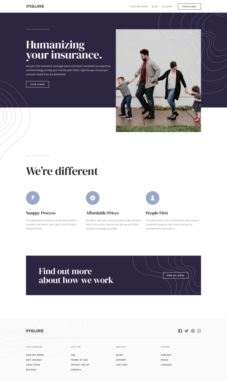
Design comparison
SolutionDesign
Solution retrospective
Hi all 👋
I decided to do this challenge with Sass, CSS Grid and BEM methodology.
Any feedback is appreciated.
Happy New Year and keep coding 😊.
Community feedback
- @ApplePieGiraffePosted almost 4 years ago
Hi, Jesús Alejandro Atao! 👋
Nice to see you complete another challenge! 😀 Nice work on this one! 🙌 I like the spinning animation you added to the hover state of the social media links in the footer of the page! 🤩
A few things I suggest are,
- Adding a minimum height to the hero section so that the background covers all of the content on all screen sizes (currently, on smaller desktop screens, it isn't doesn't quite cover all of the content).
- Making sure the background image of the mobile navigation shows up in the tablet layout of the site (it only shows up when the screen size gets below 37.5em, for some reason).
Keep coding (and happy coding, too)! 😁
3@JesusAtao96Posted almost 4 years agoHi ApplePieGiraffe 👋.
Thanks for the feedback 😀
0
Please log in to post a comment
Log in with GitHubJoin our Discord community
Join thousands of Frontend Mentor community members taking the challenges, sharing resources, helping each other, and chatting about all things front-end!
Join our Discord
