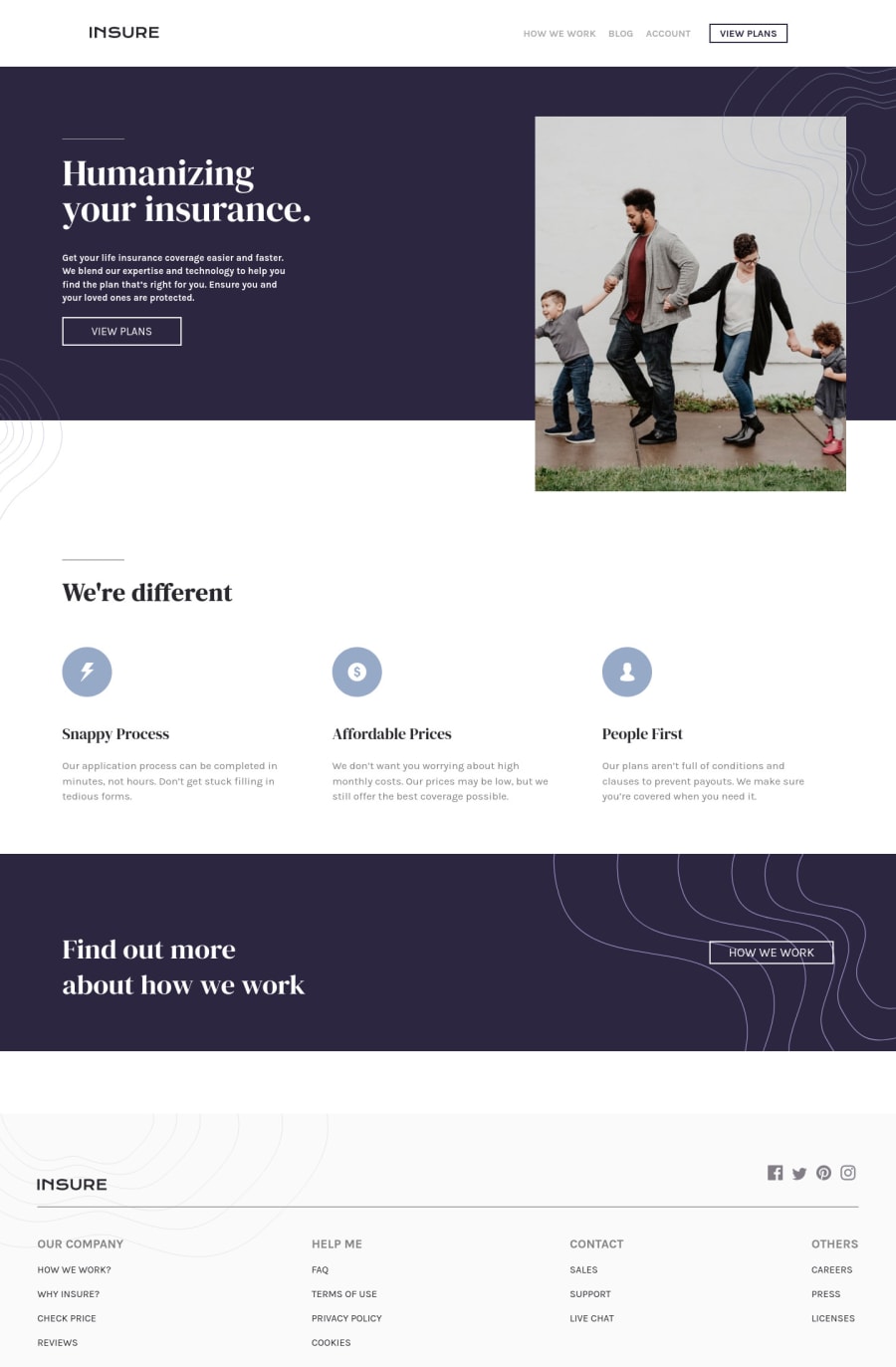


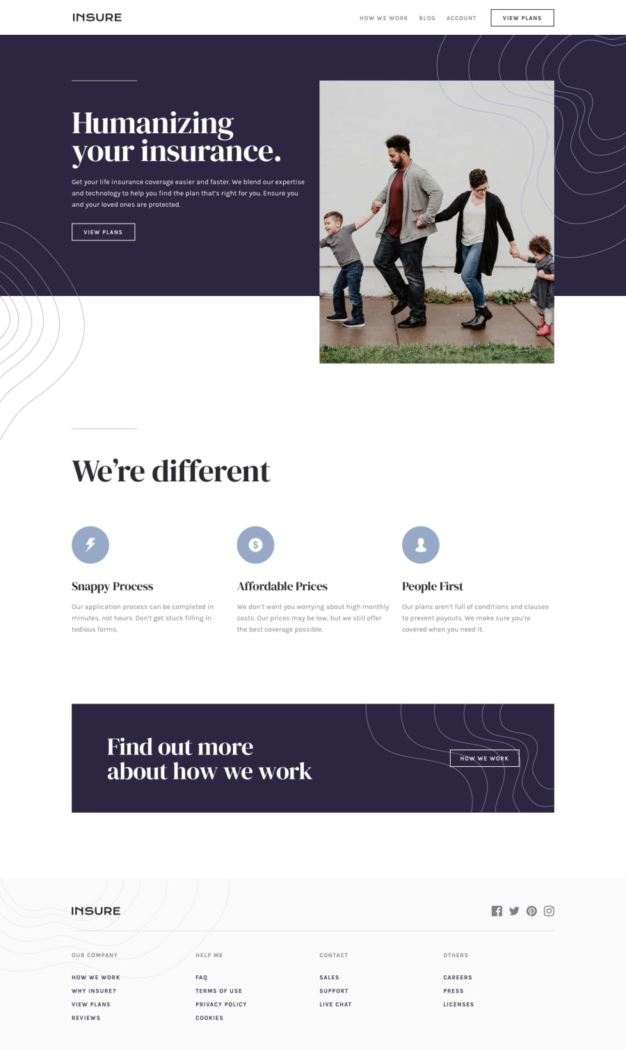
Design comparison
Solution retrospective
Here I use HTML CSS and Some JS to do the drop down menu Check my code and give some feedback. This is my final project Check the Live site. :)
Community feedback
- @emestabilloPosted about 3 years ago
Hi @senga00, looks good and page is responsive. Here are some points:
-
Use relative units like
reminstead of px -
You don't need to use one nav for mobile and a separate one for desktop. Change the CSS for larger screens by undoing
positionandtransform, along with other properties to match the desktop layout. -
There should only be one
h1for the page, the one found in the header -
Social media icons should be wrapped in anchor tags since they usually take the user to another page.
-
Instead of using divs for
<div class="navigation"and<div class="footer">, simplify by using<nav>and<footer>respectively
Hope this helps!
Marked as helpful1 -

Please log in to post a comment
Log in with GitHub
Join our Discord community
Join thousands of Frontend Mentor community members taking the challenges, sharing resources, helping each other, and chatting about all things front-end!
Join our Discord