Not Found
Not Found
Not Found
Not Found
Not Found
Not Found
Not Found
Not Found
Not Found
Not Found
Not Found
Not Found
Not Found
Not Found
Not Found
Not Found
Not Found
Not Found
Not Found
Not Found

Submitted

insure landing page

@tushar416

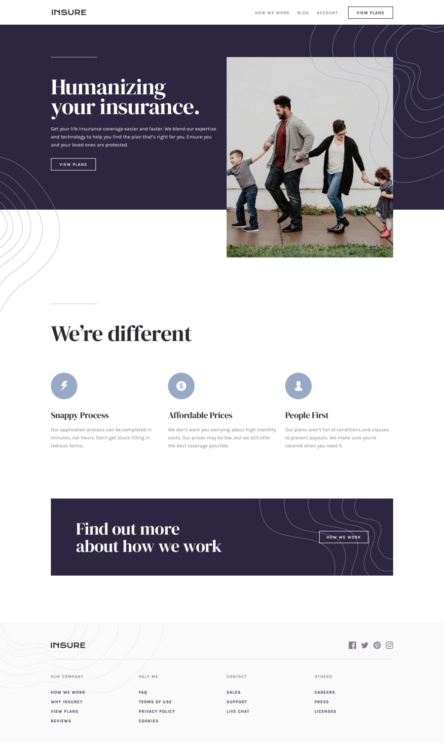
Desktop design screenshot for the Insure landing page coding challenge

This is a solution for...

  • HTML
  • CSS
  • JS
2junior
View challenge

Design comparison


SolutionDesign

Solution retrospective


It took me more time than I thought, I got stuck for a bit long in responsiveness and z-index's problem. finally, it's done. I'm waiting for your comments!

Community feedback

P
tediko 6,680

@tediko

Posted

Hello, Tushar Mehra! 👋

Congrats on finishing another challenge! Your solution looks very good and also responds well. Here's my few tips:

  • Add :focus pseudo class to interactive elements like anchors, buttons etc. Use outline property to make your website more accessible to keyboard users. Focusable elements like anchor, buttons or inputs they have applied default :focus pseudo class with outline property. These default styles are subtle and hardly visible tho. Furthermore every browser has a slightly different default style for the outline, so you probably want to change the default style. Read more about why we should change focus styles.

Good luck with that, have fun coding! 💪

1

@tushar416

Posted

@tediko, thanks a lot! for this information.

0
Please log in to post a comment

Log in with GitHub
Discord logo

Join our Discord community

Join thousands of Frontend Mentor community members taking the challenges, sharing resources, helping each other, and chatting about all things front-end!

Join our Discord