Design comparison
Solution retrospective
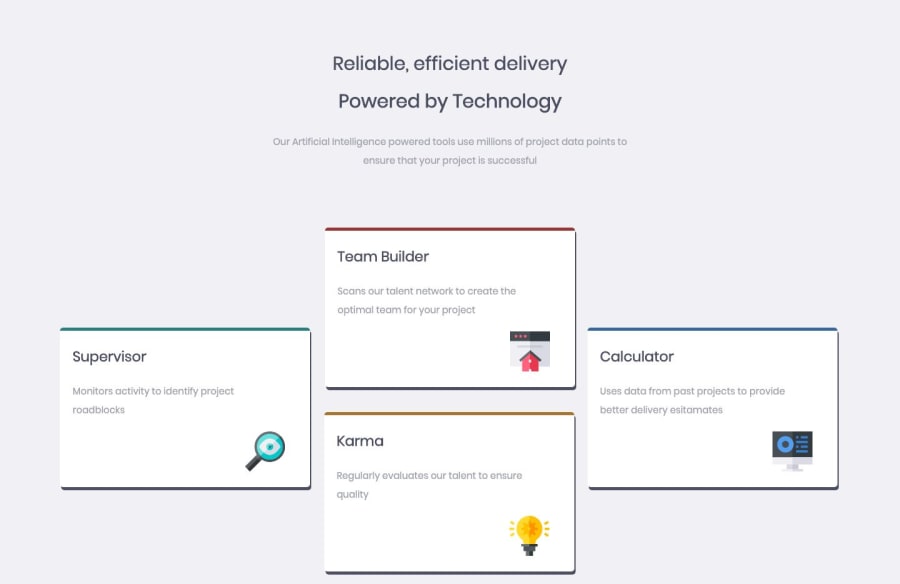
This is my first time learning HTML. Are there any ways I can improve my website?
Community feedback
- @declanslevinPosted over 5 years ago
Hi MaziluRO,
Good job on your first time with HTML!
The first thing that leaps out to me when looking at your page is that the box shadows on your
.tooldivs are very bold, it might look nicer if you 'soften' them a little. You can achieve this by adding some more values to your CSS, e.g.box-shadow: 2px 5px 5px 5px #4C4E61;. The first 2 values are your horizontal/vertical offsets; by adding the 3rd and 4th values you can control the blur and spread of the shadow. I recommend you play around with them until you find something that looks nice to you!Looking at your HTML, I would suggest that you break your h1 element into 2 separate elements, 1 for each line, instead of using a span and linebreak. As a rule you should usually only have 1 h1 element on a page at a time, so I would also recommend you change one of the lines to be a h2. As the second line is bolder in your current implementation I would suggest this would be the h1.
Your image element
altattributes could be more descriptive - they are there for accessibility and SEO purposes and are meant to describe what content the image contains. Screen readers will read out the alt text for the user. You don't need to add alt text for purely decorative images. Additionally, you should try to describe the image with a normal sentence structure, without hyphens. This will improve its readability and likelihood it will turn up in search engines.I see that you have used some IDs on your
.tooldivs for styling purposes. This is ok for a small project like this, but if you were working on a larger-scale project this is considered bad practise as it can introduce problems with CSS specificity (this is definitely an essential concept in CSS that it is worth understanding early on to save yourself a lot of headaches later CSS Specificity), as IDs will always overrule classes when targeted in CSS. Generally you should try to stick to using classes for styling as much as possible and reserve IDs for targeting specific elements with Javascript.You've done a good job positioning your divs, but unfortunately it's not very responsive at the moment. When you're ready, I recommend you dive into Flexbox and CSS Grid, which give you a lot more flexibility for positioning elements (and make responsiveness a lot easier!) :)
I hope my feedback is useful for you and keep up the good work :)
2 - @argelomnesPosted over 5 years ago
Hey MaziluRO,
You've already got an awesome feedback from Declan so I'll just mention the resources page in case you're wondering where you can dive to learn Flexbox and Grid.
1 - @MaziluROPosted over 5 years ago
Hello all,
Declan, thank you for your feedback. Really appreciate it and will keep your tips in mind in the future challenges. I am learning from a course on Udemy and this website was recommended there. Regarding Flexbox and grids, I am now learning about Bootstrap but I will look into that reource page Argelomnes mentioned. About the .tool divs:you said I should use IDs only with Javascript. Should I add different class names to each div and one common class? Like class="tool team-builder", class="tool karma", class="tool calculator", class="tool supervisor".
0
Please log in to post a comment
Log in with GitHubJoin our Discord community
Join thousands of Frontend Mentor community members taking the challenges, sharing resources, helping each other, and chatting about all things front-end!
Join our Discord
